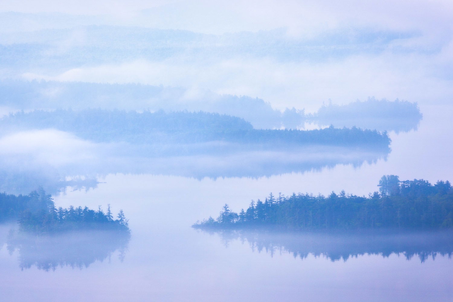
I belong to a non-competitive image sharing based nature photography club. For our Zoom meeting later this week we were asked to submit images with the theme “Am I Blue”, in keeping with our corona virus lockdown times. So since I have this one all prepped to go, I thought I would also post it here at NPN.
This was taken in May 2015, from the summit of Rattlesnake Mountain, looking out over Squam Lake in New Hampshire. Squam Lake was used as the filming location for the movie “On Golden Pond”, starring Henry Fonda and Katherine Hepburn. I had hiked for 30 minutes in the dark up the mountain, hoping for a decent sunrise, but instead was greeted with heavy fog covering the lake. So I decided to go for an abstract image, making use of the shapes of the fog shrouded islands in the lake. Not the best abstract image I’ve ever done, but one whose “blue mood” is indeed appropriate for these troubled times.
Beautiful tranquil scene. I find the blues/magenta works quite well and the image has a very good and strong painterly look. Excellent entry for the club. Blue would make a great weekly challenge theme, too.
This is not quite a usual “leading line” composition to me… I really enjoy going into the image from the “inlet” in the FG and through the lake in the MG and thoroughly impressed by the receding layers in the BG. The blue is a slightly different interpretation (I think it’s the magenta). I would have expected something more of steel blue color (which is likely biased by images with cooler WB circulating in the internets). I think the color won’t work as well if the tone throughout the image is uniform, but the lighter left hand side seems to imply the sun trying to break off the fog… which is just a lovely thoughtful interpretation to “Am I blue?”
It’s a bit like a watercolor, isn’t it? Parts of it are like that. I like the ambiguity of it. There are areas that could be clouds or could be mist or islands or water. If you wanted to go even more abstract you could lift the darks in the close islands and lose the sense of depth (near to far) they provide. But it’s probably best as is. In my opinion some of the strongest ‘abstracts’ are ones that fade between reality and abstraction. You look at a scene and it becomes lines and shapes one time. The next time you see an abstract and it morphs into realism. This one kind of does that.
There is a hint of pink in the llc. Or are my eyes playing tricks with me. You could also modify the color to be more of a steel blue if you wished. Looks like Adhika beat me with that suggestion.
An exceptional image. There really isn’t anything I would do to it, except print it. That being said, I’m not crazy about the blue. You’ve made it clear why you’ve done it that way but for me, I’d love to see it just black and white. The blue toning feels a bit like “gilding the lily” if you know the expression. The image, however, is gorgeous. So subtle and a striking POV.
Just gorgeous, Ed ! Reminds me a bit of Chinese painting - very atmospheric and indeed somewhat abstract. The blue tones are so well varied, this makes for a very strong image.
Adhika, you are correct about the direction of the light from the left. From the top of this mountain, the view to the lake looks due south, and the sun to the east/left is starting to thin out the fog slightly. About 20 minutes later it really burned off the fog, and I may share that image in my next post.
To those of you who commented on the magenta, well this is the sense of perspective that I was missing when i processed this. I was not trying to create magenta blue for creative effect. Rather the new spring colors of the trees on the islands were adding green that I was not happy with initially. So I added magenta to cancel that green out, and I kind of lost perspective on what it did to the blue tones. When I revisited that, I also felt like I went too far with Lightroom Dehaze, and in hindsight that affected blue contrast/saturation more than I wanted.
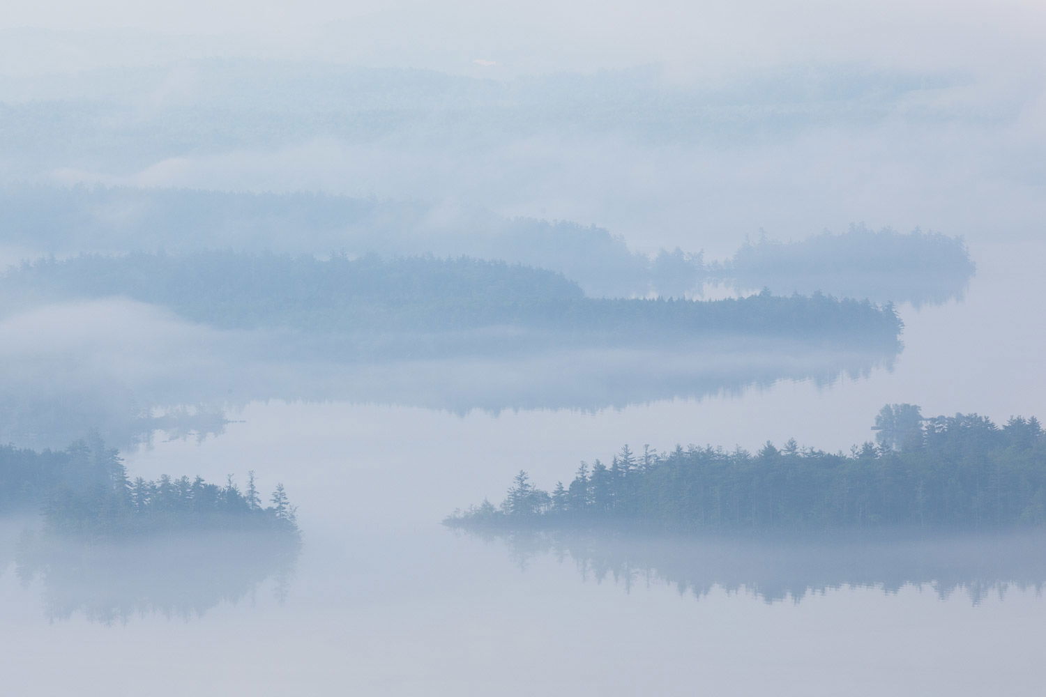
So I went back and accepted the green, eliminating the increased magenta, and backed off dehaze some too. I could not process a rework exactly the same with my dodging and burning, because I went back to the raw file from scratch, but it is close.
Has the Rework lost too much of the blue feeling ?
Several of you also commented on wanting to see a “steel blue”. If the rework does not fit your vision of what steel blue is, I would appreciate seeing a rework where you illustrate how you envision steel blue.
Wow, what an image! This shot has does a great watercolor feel to it, and the color is fine. I love those reflections. The fact that some detail is visible from that height and through fog is amazing. The scene could be categorized as more minimalist than abstract. Ultimately, what does it matter? This is a fantastic shot, and I would gladly trade one sunrise for it.
Both work for me, Ed and I find neither better. It is merely a matter of interpretation and taste. For your blue entry, I think the rework is the ticket, but the version with the magenta looks good to me too. Win/win
There’s an opportunity to crop this down too, maybe a square or a vertical 4x5. If you bring the left edge in somewhere between the two foreground islands, it generates bit of an S shape in the image and trims out potential distractions on the left. It’s quite an aggressive change to the feel of the image though so it’s all a question of how simple one wants it.
The non-magenta edit is better but I think I prefer the foreground contrast in the magenta version.
Really like how the background clouds obscure the far shore and separate the third layer from the background mountains, this is some really good fortune with the weather.
[/quote]Hey Ed! I couldn't help myself and since you asked . . . First, what a wonderful image! We don't get much in the way of fog out here in Moab and when we do, I'm gone. I kept wondering what the image would look like with "more substance", and so I downloaded , added a curve in PS to deepen overall tonality and raise contrast. Still wanted the high end to be in high values to keep the abstract feel you were originally going for. I did lighten the fog line across the image right below center to balance the picture a bit. I felt the one light section of fog on left side-near center kind of weighted the whole picture that way. All of this is subject to personal interpretation of course and isn't that the gift of processing? I submit my little thinking to you with a thank you. You rather sparked something in my own process thinking. Now, if you'd kindly send me some fog!!

Thanks for your comments @Bruce_Hucko . Your rework did not upload properly, so I can’t see it. If you don’t mind, please try to upload it again, I would be curious to see what you did with it.
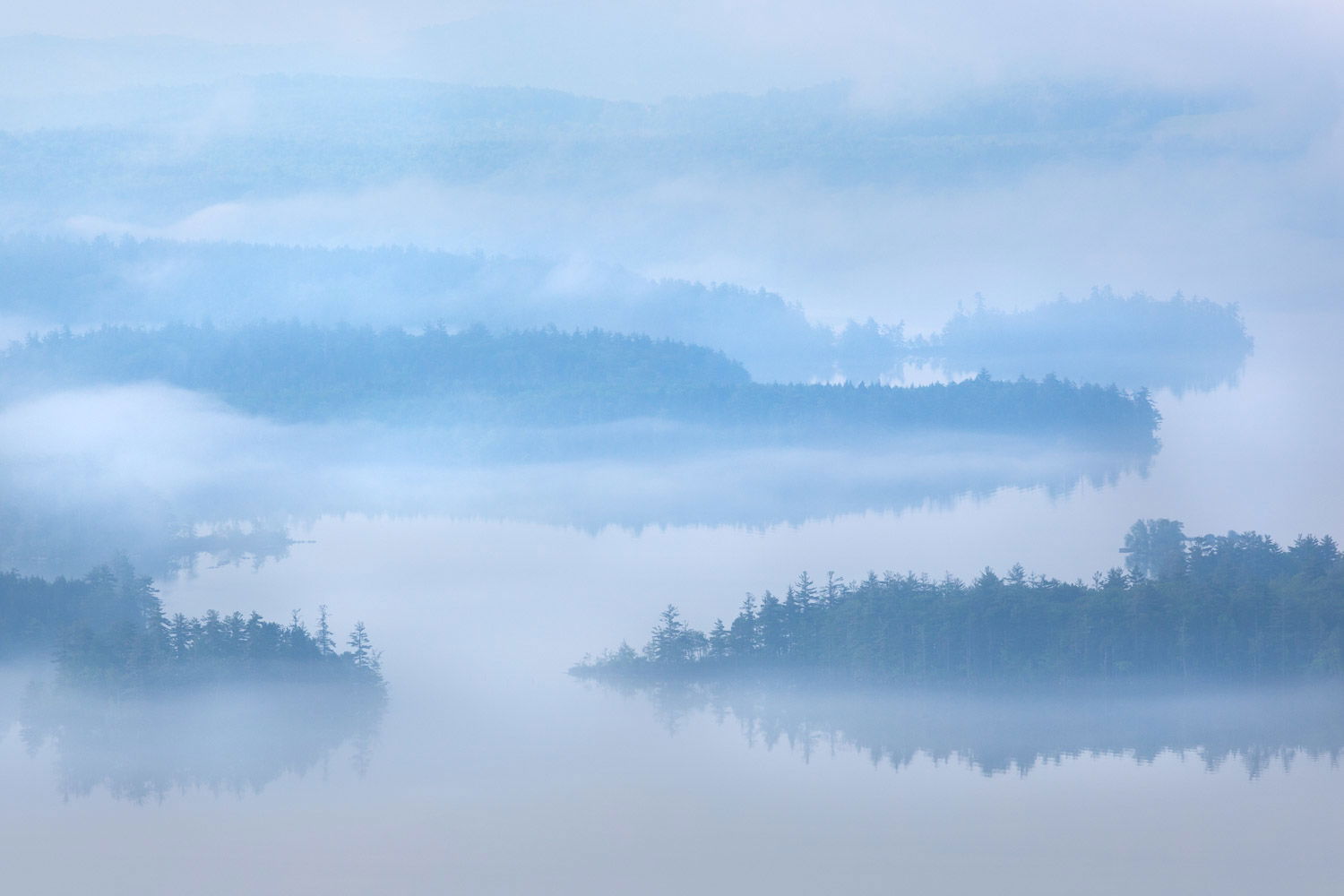
Oh and by the way, here is your Utah Fog that you requested…