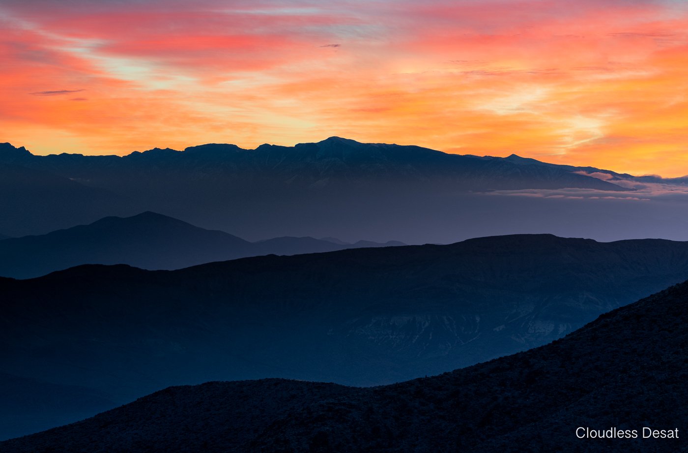
These are 2 exposures - sunrise and the landscape itself at Dante’s. I shot both images with auto ISO. and blended in PS with a gradient and then reduced the “blue” in the shadows
EDIT 1 - @João_Ferrão, @Stephen_Stanton, @Lon_Overacker - thanks for your evaluations
Desaturated the darks mainly via TK7 Color cast 1 and added in some black
Removed the cloud to see if it makes ant diff - it does imo
What technical feedback would you like if any?
Still too blue ?
What artistic feedback would you like if any?
Any
Pertinent technical details or techniques:
(If this is a composite, etc. please be honest with your techniques to help others learn)
Shot at 200 mm, F8, ISO 800 - 1 stop apart
If you would like your image to be eligible for a feature on the NPN Instagram (@NaturePhotoNet), add the tag ‘ig’ and leave your Instagram username below.
1 Like
Karl, I like the silhouette ridges and what a crazy hot sky. There is a nice balance throughout the image. The saturation is more than I usually like these days but everything is in sync…I don’t think you’d be able to de-saturate the ridges without doing the sky. I am partial to blues so the color and the gradient work for me. Very nice image.
1 Like
Karl,
This is quite striking! I pretty much agree with Stephen’s comments. It’s interesting too. I find the blue ridges to be heavy on the contrast and saturation - yet, the sky seems quite believable. I don’t think you can take away any more from the layered ridges without throwing off the balance with the sky.
I suppose if you could reduce the blues further in the shadows without altering the contrast, that could work.
Funny, like with many images, this one looks more true the more I view it. The only thing missing is that I wasn’t there to have a reference.
Lon
Hi @Karl_Zuzarte
Such a gorgeous sunrise, the layers formed by the hills are a eye candy. The blues work great with that warm sky creating a great complementary colour palette.
I agree with the comments above, the blue it’s a bit (almost nothing) to punchy and saturated (IMO) it creates a very striking image and it’s nothing wrong with it, it’s your vision of the moment but I would try to reduce the blue saturation, maybe purple using a colour layer mask.
Also I would try to raise the exposure of that cloud to make it less contrasting and distracting, maybe it will look weird, my no arm in trying 
Still, as it is it’s a beautiful image, and I bet it was a very good start of a day.
Cheers
Great work removing the cloud, for me it creates a more clean “sky layer” and a more balanced image, gorgeous edit and amazing work.
Cheers
1 Like
Very nice, Karl, the de-saturated version is a little easier on my eyes and I would agree that without the cloud the sky has a nice smooth flow. Exceptionally fine fine sunrise image from Death Valley.