Edit: reworked with a few of Bill’s suggestions. See my reply below.
Thanks!
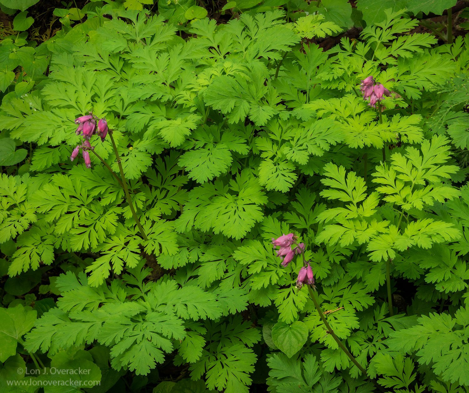
A mini landscape, but I thought better suited here in Flora. More of an environmental than detailed portrait, I liked the arrangement of the three main flowers. As you know I’m not an expert on Flora, but I do enjoy searching for beauty and fine details. Technically not the best, but wanted to share anyway.
Your thoughts, comments and suggestions welcome! Thanks!
Lon, I agree that flora works well for this. I never focus stack, so will reserve comments on that. The soft light really makes this pleasing to view. I would crop from top to lose that bare spot near the top right edge, which would also eliminate those obscured bits of pink. I think the triangular comp works well, almost always a pleasing aspect for me.
Thanks @Bill_Leggett. I appreciate the comments and suggestions. Yeah, I thought about those very things including the underlying browns up top and the hidden purple flowers beneath the leaves. I’ve reposted above with a combo of a crop and reducing the browns. Also cloned/healed a few more small distractions. While I was at it… I tossed in a little Orton.
Lon, the three flower stalks stand out well against the lovely (and nicely detailed) green leaves. The redo does a good job of emphasizing the flowers and “smoothing” the view of the greens. This is a fine “forest floor” view, that works very well at bringing to mind the joys of a walk in the spring woods.
This is a really nice scene Lon, the contrasting colors is great. Personally I think the orton is too much, it’s making the highlights muddy and looks obvious to me, dial that back and I think you have a winner
Lon, great eye(s) on this one. I would have walked right by this one and missed the neat opportunity you took total advantage on…
I like the re-post much better, but as David said maybe an in-between-er might be worth another look see…
Regardless, as always, if the field work was done correctly the in house post processing can optionally go on forever, at least in my case…
Thanks David. Yeah, I think you’re right. Opacity was 20% on that layer, much more than that and it’s really obvious. Also though, I had a Lights Luminosity mask attempting to tweaking the lighter leaves and I think that may have also contributed to the sense of muddiness in some of the brighter leaves.
I’ve cut that layer down to just 8% opacity. But I also pulled out Tony’s original Lights Triple Play and played with that and was able to restore a little crispness to the lights of the leaves.
Thanks for the comments everyone, allowing me to make improvements to the image.
YES Paul! And despite my best efforts in the field… I STILL seem to make this processing go on for ever and ever…! Some times we just have to step back and take a break.
This is so true for me too, sometimes I get nostalgic for the pre-photoshop days of slide film, at least then there were significant limits on how much time you could spend after the fact. Digital photography can be both a blessing and a curse in this regard.
Lon, I really like the rework, the crop from the top helps a lot. The triangular arrangement of the flowers is very dynamic. i assume those are the leaves of the flowers (bleeding hearts ?), as opposed to some type of ferns. They have a beautiful shape, and i love your arrangement of the leaves here.
Thank you Ed. Yes, the leaves are those of the plant/flower. But to be clear, I had to google the flower to find the name… and that’s where I was able to confirm the flowers and leaves belonged to gether.
Lon: Really like the repost and for me the Orton works pretty well. My only suggestion would be to crop more from the top to get rid of the empty patches in the upper corners but still give the uppermost flowers some headroom. Nice find and presentation. >=))>