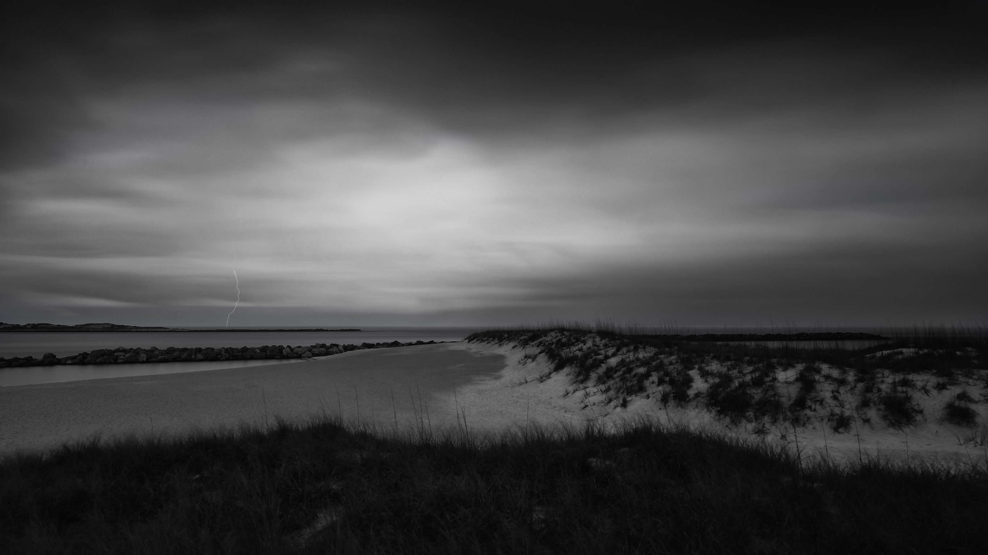
I like the first more because it is more emotionally strong. However, the second has more information in the darker areas so that’s in its favor. I prefer the sky in the first but the lower area of the second. That’s a generalization because if you did that it would look strange. But the contrast in the sky of the second image really does not work for me.
Chris, this is a nicely moody seashore scene, with the lightning as a super bonus. I’m with Igor in liking the detail in the near grass in version 2 but liking the darker sky in the original. My suggestion would be to gently burn-in the brighter, central-left section of the sky in version 2.