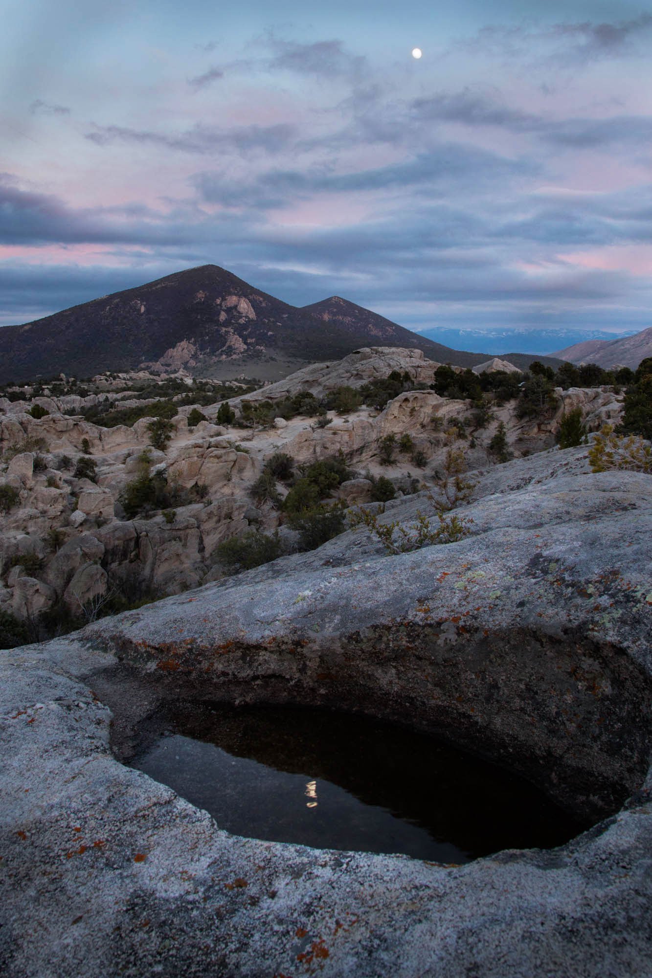
Another example of being torn between making a scenic image and pursuing an abstract of the nearest rocks. What does a fellow do?
What technical feedback would you like if any?
What artistic feedback would you like if any?
Pertinent technical details or techniques:
(If this is a composite, etc. please be honest with your techniques to help others learn)
If you would like your image to be eligible for a feature on the NPN Instagram (@NaturePhotoNet), add the tag ‘ig’ and leave your Instagram username below.
1 Like
I like this composition with the reflection in the foreground. I think you could get more separation from the browns and blacks in the midground as it’s all kind of blending together right now. Perhaps some luminosity masking and some dodging would help. The sky is beautiful with good placement of the moon.
Hi Dick, I’m not really sure if this is critique or an expression of my personal taste, I think the foreground, maybe into the mid frame could be a little darker and warmer. Overall I like the image but two things are messing with my mind! The position of the moon’s reflection is left of centre, is there quite a bit cropped off the left? Also the edge of the rock hollow on the right of the frame needs room or is there a reason why it’s so tight to the edge?
@AndySimpson @Richard_Wong thank you. I will work with your suggestions. I agree with all.
Dusted it up, per suggestions
1 Like
Nice photo and nice improvement. I really like how the diagonal slant of the left side of the tall mountain is echoed in the side of the large grey rock. If it were my photo I would crop the sky to just where the clouds begin. I think there is too much empty space sky, and to my eyes the moon is actually a distraction that draws the eye up to it, but is too small to play a meaningful part in the composition.
Tony, @Tony_Siciliano again you are right on! I wanted the moon to be in the picture, but there it is right at my feet … without the bothersome expanse of sky. Thank you.
Dick, I prefer the original composition, I like having both the moon and its reflection in the image. I think this foreground is not as much a candidate for an abstract because for me I like having that connection between the moon and it’s reflection. To me the foreground is additive here because of that reflection.
My suggestions for improvement on the original version center around luminosity. The foreground is brighter than the mid-ground and the sky. In real life the sky would have the most luminosity. I also agree with @Richard_Wong about needing to dodge the mid-ground, both to better balance the luminosity, and to get get rid of the muddy colors. And if you darken the bright gray rocks in the foreground, and dodge the moons reflection, you can call greater attention to the reflection. Here is a rework that illustrates my suggestions.
1 Like
Thank you and @Richard_Wong and the others. I have been given a great deal of valuable coaching on this. I was able to replicate your example, Ed, but I went with a bit more color in the hills.
1 Like