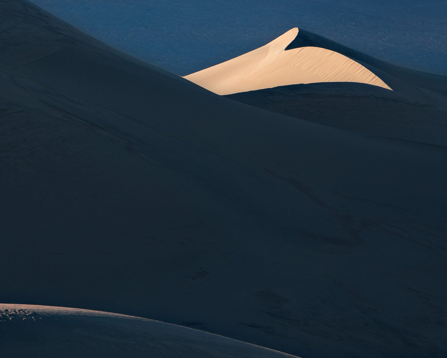
I’ve been thinking about composition options lately and usually I avoid putting subjects close to the edge of the frame. However I also think that positioning towards the edge can create more tension and potentially a more dynamic image. This image is a crop of a larger image to explore this concept. Hopefully it makes for an interesting conversation.
My intent with this comp is to move the viewers eye diagonally from the bottom left to the upper right to the highlighted dune. For me the shape of this dune is the main subject and hopefully the tonal separation of the dunes and the repeating diagonal lines help the eye move up there.
Any feedback on how you interpret the flow would be appreciated.
What technical feedback would you like if any?
What artistic feedback would you like if any?
Pertinent technical details or techniques:
(If this is a composite, etc. please be honest with your techniques to help others learn)
If you would like your image to be eligible for a feature on the NPN Instagram (@NaturePhotoNet), add the tag ‘ig’ and leave your Instagram username below.
I really like the composition, but something seems a little unbalanced here. I’m thinking it might be a contrast issue. Maybe those dark shadows seem a bit overwhelming relative to the light parts. Would opening them up more provide more interest in these large areas of the image?
I thought the same thing. It works really well the way it is. We’re taught that so much darkness should be avoided but it really does work here. I would experiment with the idea of showing more detail in all that darkness to see how it works.
I like the colors and idea of this image. I looked at the scene before reading your intent and found my eye going to the bright dune very quickly. I have to agree that a bit more detail in the shadows might achieve the desired flow.
Nathan - I see the intent you have here. I too looked carefully at your image before reading your comments. For me, it’s all eyes on the top lit dune, which has a very interesting shape. As a soft counterpoint, there is the subtle strip of faded light in the lower right corner. To my eye, the counterpoint is fairly far away from your primary element and possesses too little power to pull the eye away from the very bright dune above. In addition, the location of the more softly lit dune is brightest at the edges of the frame further compromising its power within the frame. Is there a wider crop to give the dune in the LRC more space and power.
Finally, the shadowed dune in the middle perhaps is more in the realms of dead space rather than effective negative space to my eye. Its lack of detail has been commented on by other reviewers, perhaps addressing the sense of emptiness (negative space) inside. I think the challenge with augmenting the details in the shadowed dune are the lines moving diagonally (LLC to URC)/perpendicular to the implied line between the two primary/secondary elements.
Thanks for putting up with my analytical approach - hope its helpful!
I think this concept works brilliantly in this image.
I agree, just a slight bit more detail would help IMO.
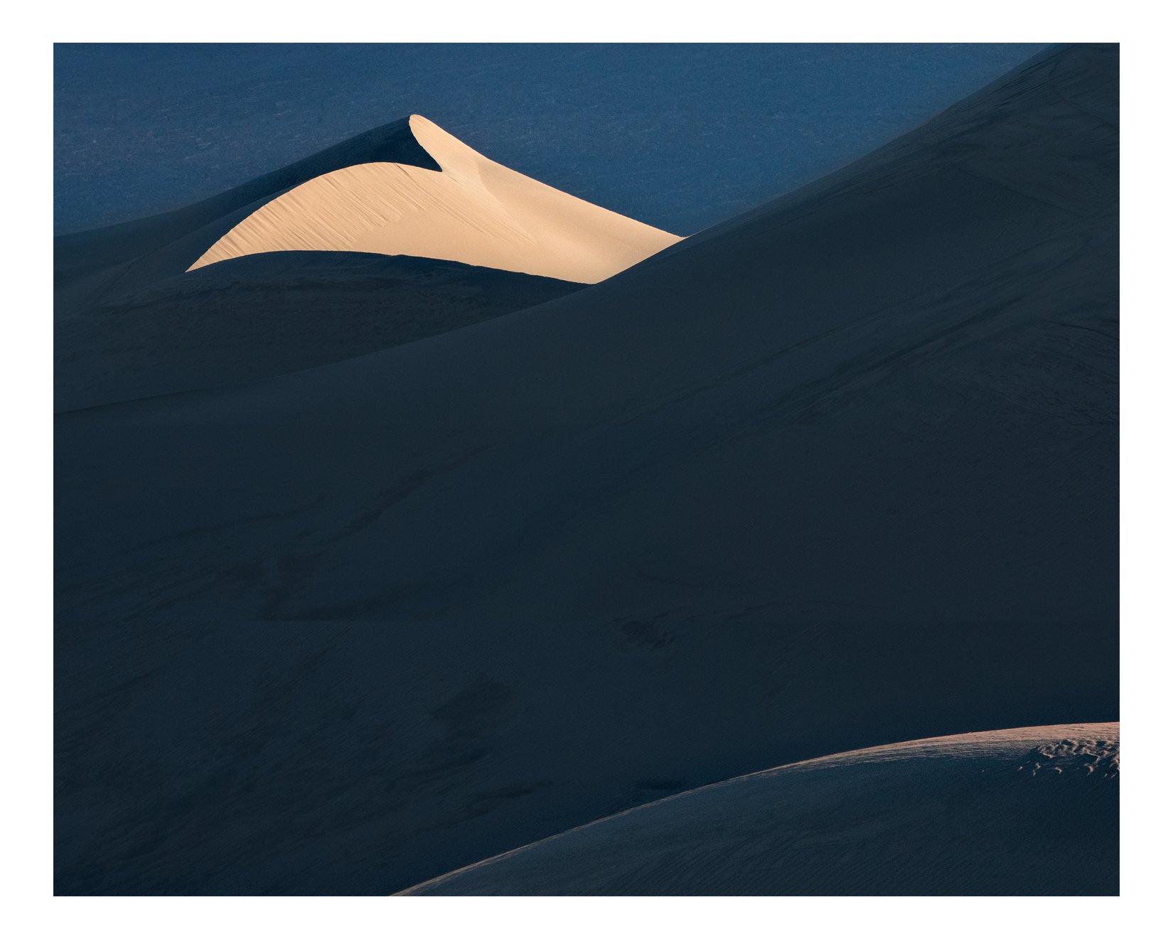
I agree with this too. I’d also add that if the makers intent was to pull the viewers eye from the LLC to the sunlit dune at the top, then the bright strip in the LRC works against that visual flow. But being left handed, and preferring left to right visual flow, how about trying a horizontal flip, in that case the foreground sunlit dune (now in the LLC) , creates a left to right flow.
In the flipped image, I also like how the mid-ground dune ridge pulls you from left to right, but then the background dune has a reverse in direction, first from left to right, then the reverse.
Nathan, I like the bright elements near the edges. This is a good example that the so-called rules don’t always apply. It’s good to test that out, because I certainly don’t compose this way, but I like the look. The thing that I don’t like in this particular image is the dune in the middle feels too large in the frame, with little interest. I’m not sure that lighter shadows would alleviate that either. For me, my eye goes right to the upper left, but the distance between top left and lower right is too far and my eye gets lost on the way.
Nathan,
Rules are made to be broken and I definitely think that applies to this beautifully crafted image. I personally like the alternating bands of shadow and light as they make for some nice graphic elements and lines for some visual tension. Just a touch more shadow detail would be nice, but not much. I have never flipped an image, but I do like what @Ed_McGuirk has done with his rework. I think it is because we read left to right so I usually like the flow to run that way. My only real suggestion would have been a little lower POV to reduce the middle ground shadow a little bit. Of course that might not have been possible. I really like what you have done here.
I take your point about not enough detail. That was an experiment on my part in an attempt to remove contrast and create some negative space. I used a solid colour overlay in hard mix blend mode.
Ed’s flip is interesting as it creates a totally different feel to the image - it’s tough to put into words why.
I took some liberty to transform stretch the top and the bottom of the image to remove some of the dead space in the middle. Hopefully this provides a bit better balance. Here’s a redo wth the darker shadows and another with more details
Nathan,
I really like the direction @Igor_Doncov took this one. The increase in highlights and the added contrast, especially in the bottom right, really balances this very well for me.
I can see that @Igor_Doncov’s version is actually darker in the shadow but it is because that it’s more contrasty (thus giving the appearance of more details) there, but it seems to have pushed the blue saturation a little bit too much. The first version of your redo is the one that I like the most, Nathan.
This is a powerful image! I think the positioning of the highlighted dune face is very effective, and the reduction of the middle ground area works well. I think Igor’s interpretation is effective, as the main issue, for me, in the middle ground, is not darkness but low contrast. The increased saturation in the blues is easily adjusted according to intent.