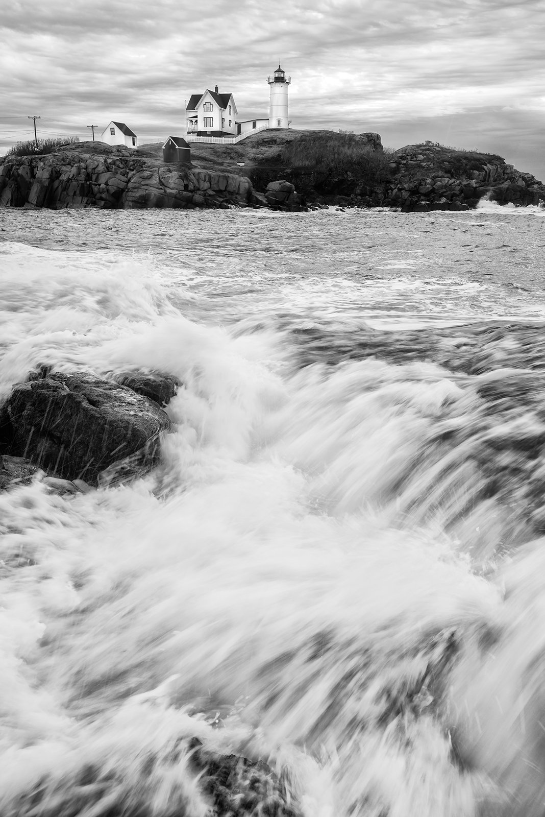
Sorry folks, here is another one from our recent trip to photograph Nubble Light in York, ME. I did get a little wet on this one and had to dry out my boots and socks later on. I was wondering if the clipped off rock on the left was a deal breaker before I spent any more time cloning in some more details in the water. I can’t believe I didn’t notice that until viewing the file on the computer. Thanks for your time.
What technical feedback would you like if any?
All C&C welcome
What artistic feedback would you like if any?
All C&C welcome
Pertinent technical details or techniques:
(If this is a composite, etc. please be honest with your techniques to help others learn)
Nikon D800, Nikon 17-35 @ 28 mm, f 13 @ 1/25 sec, ISO 400, cable release & tripod
If you would like your image to be eligible for a feature on the NPN Instagram (@NaturePhotoNet), add the tag ‘ig’ and leave your Instagram username below.
I like the on this image. The cropped rock at the bottom really doesn’t bother me. the other option would be to crop the image just above the rock and that appears to work also.
Ed, I like that you’ve done this image in black & white. I think the balance between the darks and lights works very well in balancing each other. I also like the contrast between the details of the lighthouse against the blurry waterfall. So, no the lower portion of the photo doesn’t bother me at all. Really nice photo Ed.
Ed, you did not ask for a comparison, but I could not help myself from going back to your previous B&W and comparing. I much prefer the wider view and find the other scene more dynamic. It pulls me into the image in a way this one does not. In this one, the clipped rock is not ideal, but to me is not an image breaker either. I like the processing of the water and the buildings, but I could see some more drama brought into the sky.
Ed, when I first looked at this image, I was going to say that the foreground is not working for me and I find the cropped rock distracting. And then I read @Harley_Goldman’s comment and I looked for that previous image and boy I love that one! I have missed that previous image so I am glad you posted this one.
You got some nice stuff that day, worth having to dry out the socks and shoes.
At first glance the clipped rock on the left didn’t bug me; the drama of the water obscures it. Interestingly though, once pointed out it is hard to look away from. Not a big deal, but I agree not optimal. Otherwise, a very nice black and white, although I also agree with the above suggestion to experiment with more contrast in the sky.
It’s a bit more contrasty than I would suggest, particularly in the water that is not foamy. I feel that darker water is unnaturally dark, especially if you compare to the more distant water. I also cropped a bit off the bottom as a test but I’m not convinced it’s better.
Ed,
You mentioned the rock and now I cannot unsee it. Not sure about a deal breaker but it is distracting for me. I have to agree with @Harley_Goldman and love your previous post and the wider view. Wet feet are never fun!
Well, gotta be honest and say this one doesn’t rank up there with your other iterations for me. Not just the clipped rock on the left, but the whole left just seemed crunched or cut off; including the island. Also, there isn’t much texture in the water action.
I do think Igor’s rework and crop makes the image stronger. In fact, the crop and getting closer to a 4:5, 5:7 ratio actually reducing the feeling that the scene is cut off on the left.