@ja9erking
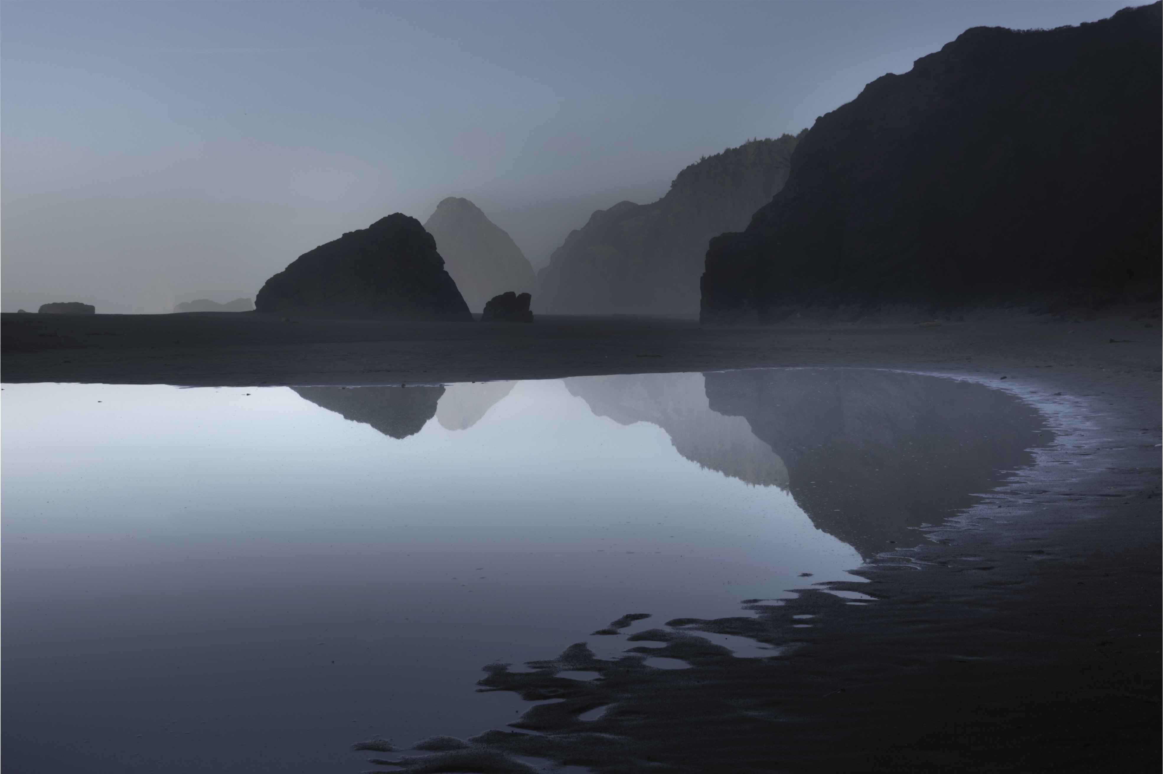
This was taken in last September and is one of several compositions I made in this location on the Oregon coast. Interested in any and open to all feedback on this image. Using Phototshop, I first increased the dynamic range through aligning exposures and then using masks to blend ligher and darker areas of the image. I then merged the masks and used NIK filter: Color efex pro. To increase the color range. I tried to move away from monochrome blue and introduce some warm tones to give it spatial depth as it seemed so flat to me.
1 Like
I honestly think that this is super gorgeous. I really like the color rendition and the composition is very nice. I also like how things become more diffuse in the far back creating depth in the image. The warm tone that you add in the back is perfect.
Right along the bend of the shoreline, there must be some kind of patchy fog that create that brighter area. I am thinking that could be fixed because I spent more time there than I would like to figuring out what’s that.
Thank you for sharing this beautiful image, Janine. This is such a calming image and this has inspired my day.
1 Like
Beautiful image. Great reflection and the blues work well for mood. It is probably just a photographer perception thing, but the reflection being brighter than the sky looks a bit off to my eye. A non-tog would probably never have that register. No other thoughts/suggestions.
1 Like
Hi Janine. This is really a great image and really admire the effort you have gone to in PS to process it.
I only have two comments on the cc side. I agree with Harley about the reflection being lighter than the sky. Would look more balanced if that was corrected.
My other point is on composition. I’m not saying I don’t like it as it is because I do. I would have a play with cropping in from the left. Maybe yo a more 4:5 format. Maybe just to the right of that small mound (I’m looking on my phone so can’t tell what it is) I feel there is a lot of open space on the left and the right is quite heavy. Cropping as I suggest would bring the sides into balance a bit more
Hope it helps 
1 Like
Hi Janine,
I like the colorization that your that you’ve acheived in this image and to me it’s a unique take on the famous Oregon sea stacks.
I agree about the reflection but from a technical perspective it looks like you’ve made a crop and have a thin slice of a blank layer appearing on the left and right hand side of the fame. Content aware fill should sort that out.
1 Like
Oooh like this one. In the British vernacular, this is just my cup of tea. Love the two tone colouration and the simple layering of different densities of shapely rocks. Very well done, eye catching a nd an interesting composition.
1 Like
Janine, this image is wonderfully moody and mysterious looking. And as others have noted, the blue color tones are great, and help add to the mysterious mood. And I love the compositional idea to have the curve of the shoreline lead the viewers eye into the reflection. I also like that your comp only shows a small part of the reflection of the cliff on the right. By keeping that reflection small, you avoid having it overwhelm the more interesting reflections to the left.
While this image is really good, I think it has the potential to be taken up a notch or two. I think @Eugene_Theron has a great idea to crop from the left to end up at 4:5. The small seastack on the left (with no reflection) pulls my eye away from the center of the image where all the good stuff is located. In terms of the luminosity of the sky vs. the reflection, I would suggest both darkening the reflections, and brightening the sky. With all the mist in the air, I think you can add to the ethereal mood by dodging the sky and the distant seastacks. If you don’t mind, here is a rework that reflects my comments. I think changes in this direction would make an already good image even stronger.

Wow! thanks Ed et.al for the helpful suggestions. the crop really helps. It brings your eye into the image more on the third than in the middle. Also balancing the reflection with the sky looks good. I’ll go now and see what I can do with the original.
Janine,
I am rather enjoying this lovely scene as it is dripping with mood and mystery. The fog has created some wonderful atmospherics and I love the sweeping curve with the tidal pool. The predominately cooler tones contrast nicely with the hint of warmth on the BG sea stack. The small tweaks on @Ed_McGuirk’s rework have elevated an already wonderful image another notch.
Hi @janine, I love this shot. Really nice composition, I like the leading lines created by the coast and the dark mood works very well with the scene. A little bit of mist in the background would add more interest but the shot is fantastic As is. Thanks for sharing.
As the others have said, I really love this image a lot. The different tones of blue are really eye-catching.