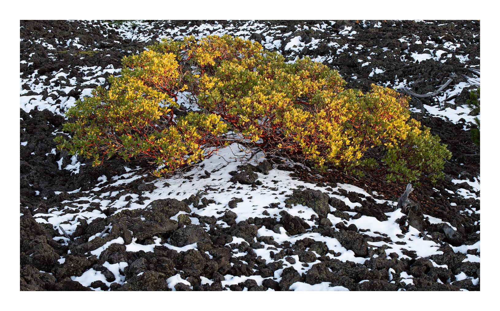
Yesterday I thought I’d see what going on up at McKenzie Pass and was surprised to see snow on the ground. Surprised because we haven’t had a snowfall for a couple of weeks. There are huge black lava fields up there with dead trees scattered about but what intrigued me were the patterns of black and white for the snow was clearly in a state of melting. I finally gave up thinking the subject on it’s own was not enough for a compelling image until I came across this manzanita glowing in the last light of the day.
I forgot to mention that this was my recently purchased Tamron 70-200 maiden voyage. Shot at 82mm.
I’ve decided to post 2 versions - the first a warm version with colors boosted by LAB processing and a cooler more restrained interpretation. Which appeals to you more?
Offhand, I like the warmer version. The 70-200 was my favorite lens, now I find myself with a 100-400 on the camera most of the time. I think the centered comp works well. The manzanita stands out nicely from the background and light is lovely.
I’m having a harder time with this lens than I expected. When you get a good comp with the 24-70 it really sings. I use those leading lines into the distance and the fg adds so much to the overall image. The new lens flattens all that space and you have to compose as a 2 dimensional entity. So far it hasn’t been as satisfying but I’ll be revisiting the Painted Hills in a few days. There some great shapes there but they’re blocked off by a fence. So that will be a good test.
PS the cooling seemed to have taken the vitality out of the yellows. Perhaps I’ll saturate them a little.
I like the image with the warmer, more vibrant color best. Although the bluer lava might work better overall. Have you thought about combining the two in this way?
Good job finding a composition in this. This must’ve looked a bit chaotic, but you definitely found the right patterns to bring some order to it all.
I think that my preference is for the cooler toned image. While I like the warm light in the top image it feels a bit harsh overall for some reason. I like how the color in the vegetation contrasts with the stark black and white of the rock and snow.
This composition speaks to me. It’s busy but in a good way. I do wonder if you have just a tiny bit more on top because the top of the arc created by the trees is a little too close to the top for me but it’s really nitpicking. I like the idea to combine to cooler rock and the vibrant yellow on the leaves. Beautiful work, Igor.
I am liking this quite a bit, Igor. Definitely the warmer vision works better for me.
I use my 70-200 probably 90% of the time on my camera. I just see that way. I have a 14-24 that rarely gets out of the pack. I will be looking to get longer than the 200mm. Those comps just work for me and my vision.
There seems to be a general agreement that the warmer version is better but the cooler could be improved by a saturation of the warmer colors. I applied the “Make it Glow” action which targets primarily the warmer colors as a test (I usually just use the HSL adjustments in PS). I used it at 40% opacity. It’s up above so that you can click and compare.