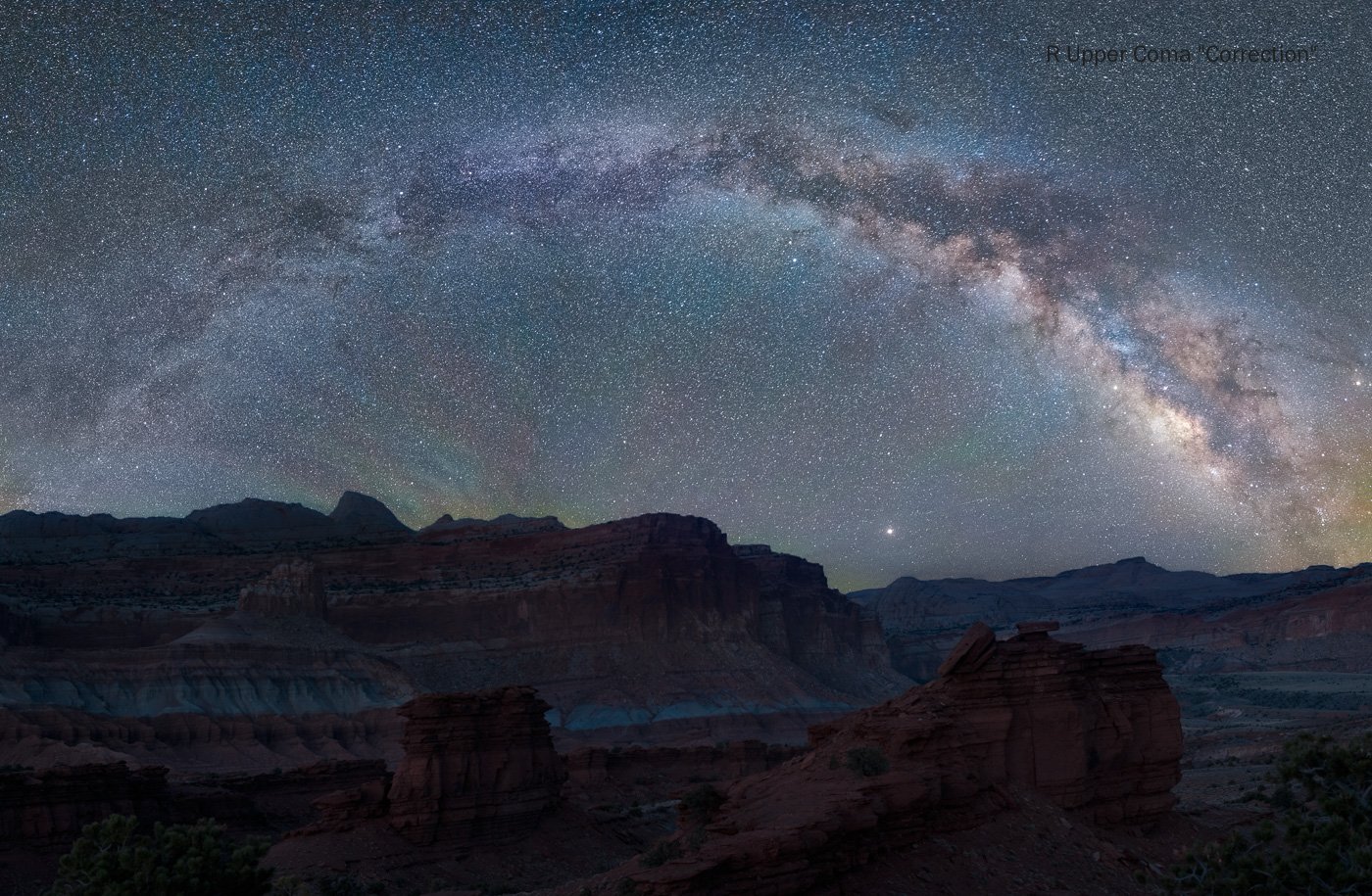
This was in Capitol Reef, Utah. I wanted to shoot the MW pano with the foreground you see but knew I wasn’t going to be there that night - hence this composite. BTW, I used Photo Pills to determine that the MW would look like this at this location
Right Upper Coma “Correction” - Copied L Upper corner - only putzing around for the fun of it
What technical feedback would you like if any?
Sky and Landscape processing ( for night )
What artistic feedback would you like if any?
Do the 2 blend ? It was a 15% moonlit night
Top Pano aesthetically better ?
Pertinent technical details or techniques:
(If this is a composite, etc. please be honest with your techniques to help others learn)
Sky - 7 image verticals blended
If you would like your image to be eligible for a feature on the NPN Instagram (@NaturePhotoNet), add the tag ‘ig’ and leave your Instagram username below.
Hi Karl…challening shots to capture for sure! Congratulations on a clear night and a well stitched beautifully symmetric MW arch. I’m not partial either way to the crop, because the arch is so very dominant and the ground crop makes little difference to my eye. The lighting on the foreground looks fantastic with just the right amount of ambient light, good detail without going over the top, and low noise. The blend looks just great. You say it wasn’t the same night?
From a critique standpoint, there some streaking that appears to be “brushstrokes”(?) under the arch on the left moreso than the right. The colors of the MW are pleasing and I’m no astrophotographer, so departing any colors from “reality” here is nothing I can comment on. There’s some movement of the stars (vs. coma) in the upper right corner of the image that serves as somewhat of a distraction. Perhaps that’s clon-able.
Managing the sky and my comments that follow has more to do with my personal taste only and thus cannot be received as a “critique” perse’. I’ve often found that images with particularly dense number of stars in the ambient sky serves as a harshness or grittiness that is aesthetically less pleasing to me in nighttime shots. To my eye, the density of the stars competes with the MW itself, so much so that it carries a component of grain or noise to the image…again, my personal/aesthetic response. I don’t know the degree to which this is manageable.
Finally, the atmosphere does appear to have color variance, which seems appropriate to my understanding. The stars do not have much color and I understand that is something that may be achieved and desirable among astrophotographers.
These are tough shots, not only to acquire, but the post-processing is super challenging as well. Congratulations again on this great capture. You’ve got excellent raw material here to work with !
Hi Jim
Many thanks for your lengthy observations - much appreciated!
Re Brush strokes under the left side of the arch - this is air glow captured - was more green than what you see but less reddish
Re Coma in the R hand corner - this is a natural occurrence with most lenses - can be minimized by NOT opting for " Enable Profile Correction" in LR - or going only 25 - 40 % (vignetting) - it is a lot of work correcting these but I just might do it,
Why does the L hand corner not have it ? I filled in space when stitching
These are hand stitched as I did not level my tripod before the pano - serves me right - took 45 minutess to do this.
These 7 vertical images have a 30% overlap - which means that the sky has 70% x 7 or 3-4 images compressed into 1. That can be forgiving in terms of sharpness but that also means a lot more stars which is what is causing that aesthetically less pleasing view to you - but OK with me 
Star color and not chromatic aberration is what one does want - I must have messed up somewhere along the line
I hope that the above makes sense
Thanks again @Jim_McGovern
Thanks @Karl…good to know about the coma issue exacerbated by LR lens correction - didn’t know. Nice work!
1 Like
These are just my personal opinions so probably not worth much. More and more I’m losing interest in MW images. With the long exposures necessary, there are just too many stars captured and the images look “crunchy” is the best way I describe them. Also, I’m not a fan of taking a sky from another date and place and compositing it into another image. All that being said I feel you’ve done a good job with the blend. The FG looks natural. JMHO
1 Like
Karl,
A fantastic Milky Way image. Can’t say I’ve seen a lot with both ends touching the horizon - like a rainbow! I think the stars look great too. One can talk about all those stars - we all know that 20seconds on the modern sensor captures amazing things - and tons more stars that we see with the eye just standing there. (Well, at least I can’t see all those!)
As Jim eludes to, the night sky and MW are the dominant subject and at least for me, the foreground landscape is almost irrelevant - other than to provide an anchor, base. The landscape is appropriately dark, so you did well there, but so dark that revealing any location details is not the message here - so any foreground could have been used for that matter. But kudos for doing the research and getting the location and conditions correct!
Really enjoying that night sky and Milky Way (great job on the stitch btw). The landscape isn’t doing much other than providing that anchor.
Lon
Thanks Lon - that stitching was a pain - good lesson learnt - I did get a leveling base after that
And yes, our sensors see a LOT more stars than we can
Hey Karl, overall I think you did a nice job with the processing. The foreground looks nice and natural, dark enough that it feels like nighttime and the right cast of blue you would expect. I like the foreground of the third one the best, the second feels cut off. I would like to see more space on the right side as the mw feels a little cramped, I prefer to give space to show sagitarius as well. I would tend to agree with Jim on the amount of stars. I used to go for the maximum amount of stars, but in the past few years I intentionally try to tone down what the camera sees through darkening and a bit of blurring to make a bit more like what we see, but still enhanced. Also, I would recommend doing 50% overlap when shooting these, it allows the software to drop off all the edges and just use the sharp center of the frame, it can also help to do two rows even if you crop most of it out so it has better data to work with. Still a keeper though, nice Karl!
Thanks David!
Quite a few lessons learnt:
Levelling tripod to start with
50% overlay ( have to be quick moving from 1 frame to the next )
Start at least 1 full frame before the MW and similarly finish 1 full frame after
2 rows give some nice space to work with - above the arch as well as with the foreground
Intentional blurring of stars by adding Glow ?
Again, much appreciated @David_Kingham
1 Like