Hi Folks,
I’m sharing a couple more images from my growing collection of ICM photography. A couple of these (#1 and #3) still fall into the abstract expressionist camp in my mind. The others are significantly less abstract, and I feel like they would be a completely different collection. In my mind, these are still landscape images, but let me know if the “original” subject is too abstract for this category at this point.
I’m sharing several that take a slightly different approach from my last set shared a few days back. I’m interested in which ones are interesting to explore and which ones look merely like a camera malfunction ;-).
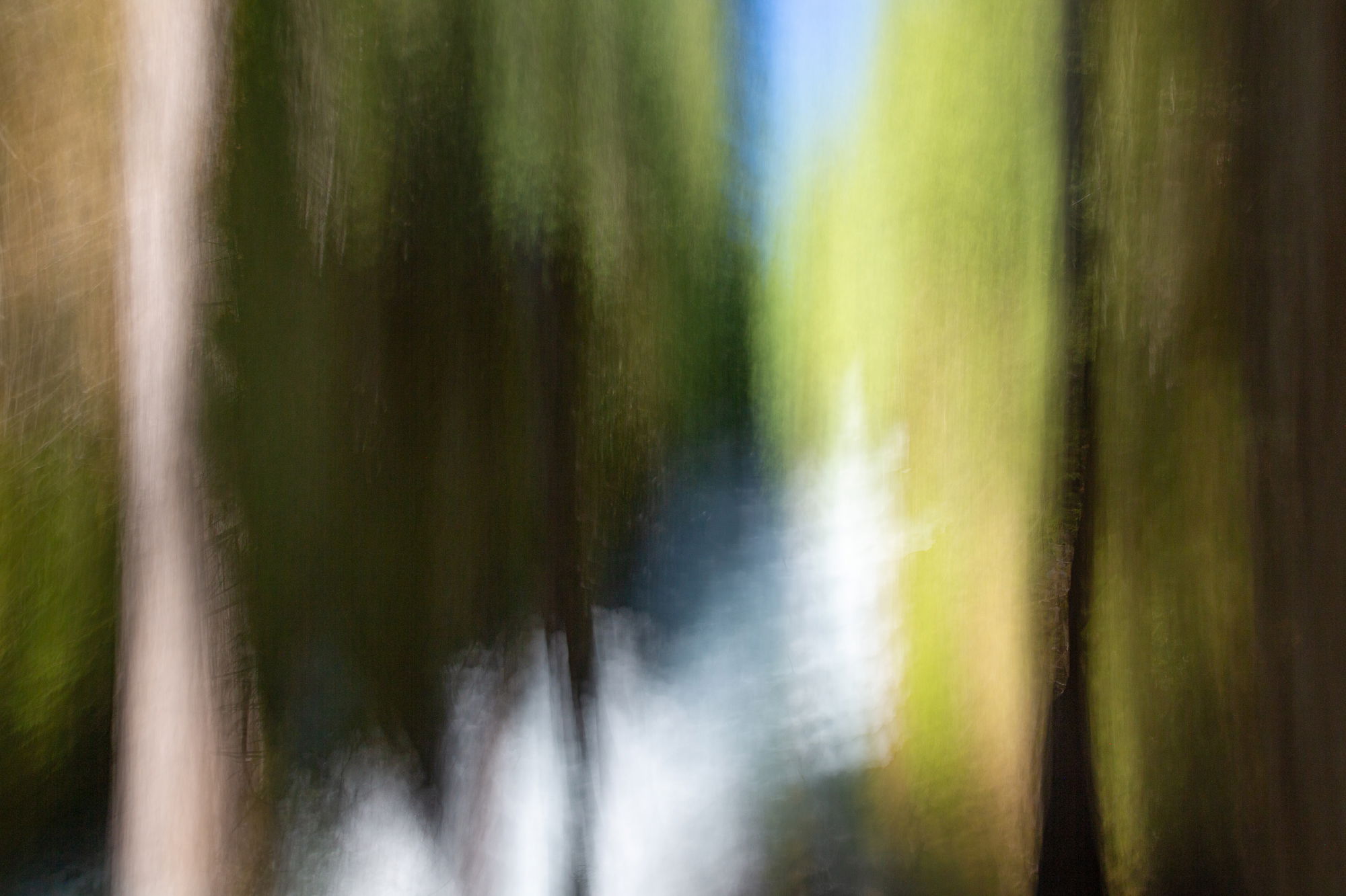
#1 Sahalie Falls on the McKenzie
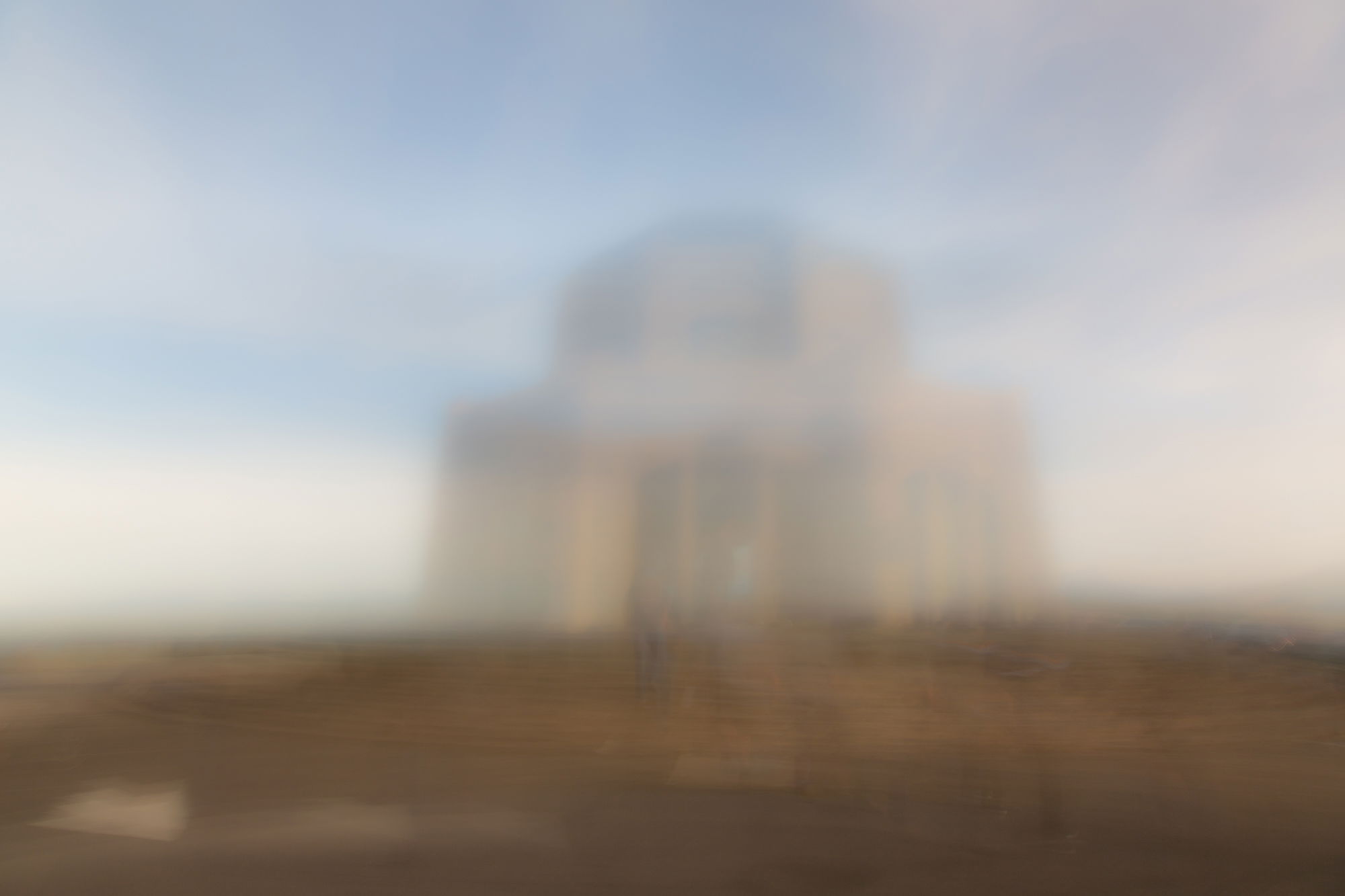
#2 Crown Point Vista House
#3 Multnomah Falls
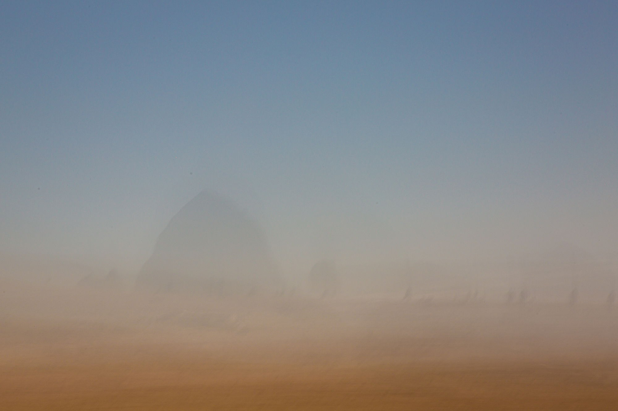
#4 Cannon Beach
What technical feedback would you like if any?
Do you see any distracting artifacts, noise, or texture that makes an otherwise interesting image flawed?
What artistic feedback would you like if any?
Do you find the less abstract ones interesting at all? #2 and #4 clearly have identifiable (and in the northwest, recognizable) subjects, while the others come closer to color field abstraction, though of course, more organic and less geometric than Rothko (not that I’m comparing myself to Rothko, just naming a famous artist in that style).
Pertinent technical details or techniques:
(If this is a composite, etc. please be honest with your techniques to help others learn)
All single images, taken using a slow shutter speed, light dampening filter, and intentional camera movements.
If you would like your image to be eligible for a feature on the NPN Instagram (@NaturePhotoNet), add the tag ‘ig’ and leave your Instagram username below.
You may only download this image to demonstrate post-processing techniques.
Marylynne, I have been experimenting with intentional camera blur for some time, mainly influenced by the works of a local photographer in Hong Kong, Dr Leo Wong. He used multiple exposures instead of slow shutter speed to create his impressionist compositions. For me ICM is challenging and somewhat frustrating as it is not easily reproducible. Also one has to strike a balance between just enough blur with a pleasing composition and over blurring to the point of abstraction. Of your 4 images, #4 Cannon Beach seems to have strike the right balance to produce a somewhat ethereal image. The abstract images do not resonate with me at all; to me they are too far from conventional photography.
1 Like
I love #1 a lot, Marylynne. The vertical lines are are very nice and the color distribution is perfect. The green evokes the trees and the blue evokes the sky. I also like #4, not as much as #1 though. #2 doesn’t resonate with me at all and I am not sure I like the rendition of Multnomah Falls (which I assume is the bright blue part in the middle) in #3. It looks too much like a light leak.
All in all, ICM is hard, but when you get it right, it’s very rewarding.
1 Like
I also like number 1. For my tastes icm works best when you can’t see indicators of movement and the result is something abstract.
Number 1 to me is in painter category which works for me
1 Like
Number 4 for me as well. It has pleasing colors that flow into one another. Number 1 is too jarring in tones.
1 Like
I really like No 4. Nice sense of mystery to it. No 2 to a lesser extent. I would like No 1 without the high key splashes in it. And No 3 I must admit doesn’t do much for me. JMHO

1 Like
I’m enjoying these differences of opinion. This is a totally new form of photography for me, and I’m still experimenting to see what I like, what others like, and where it takes me artistically.
It is an acquired taste for sure, and not necessarily acquirable or desirable to acquire, but I’m having a blast!
Keep the opinions, impressions, and preferences coming!
ML
Marylynne,
I too enjoy the comments and the wide variety of opinion - all of which are valid of course given the abstract nature of these images. There is no right or wrong.
My preference is for the first. What I like about this one and comment in general is that it is truly abstract. I have no idea what the subject was before the ICM application. Conversely, the others are more recognizable and they make me feel more like, “oops, I kicked the tripod…” like in #2.
In #3, it’s vaguely recognizable as a waterfall - which makes me wish I could see the waterfall…
#4 is a bit more enjoyable, but a bit more looking like a double exposure or a slide sandwich (dating myself…) I do like the color transition and the mystery of what the heck are the darker objects scattered around.
Keep experimenting - I am too. I think it’s a good thing to expand one’s vision.
Lon