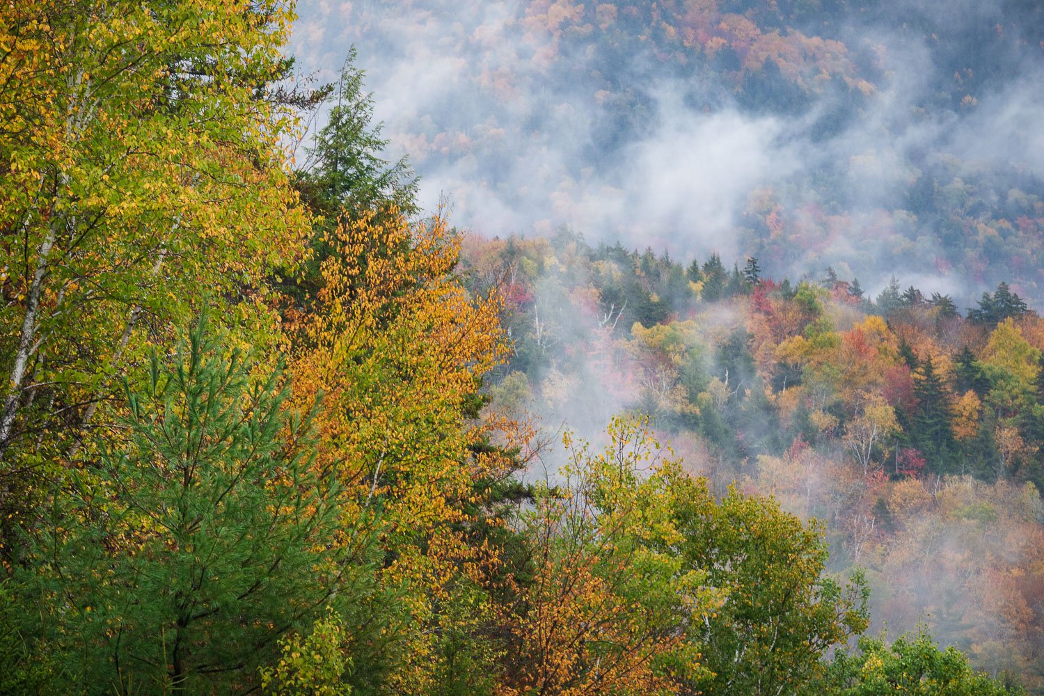
Autumn 2020 photo project - taken 10/03/20 in Waterville Valley NH
My last day in the White Mountains of New Hampshire was a rainy, foggy day. For my prior post, I had been about 30 miles north of this location, and the rain got so bad that I gave up and drove south on the interstate to head home. After awhile the rain calmed down a bit, so on a whim, I got off the highway and onto a side road that I don’t frequently visit. Luckily I found this view across the valley. One of the things that I enjoy most about photographing autumn in New England is just getting lost on backroads and discovering new locations.
Based on Harley’s comment looking for a wider view than the original, which crop do you folks prefer ?
Specific Feedback Requested
Any critique or comments are welcome.
Technical Details
Is this a composite: No
Canon 5D MKIV, Canon 70-200mm f4 lens, at 176 mm, ISO 400, 1/20 sec at f11
Interesting reading Ben’s take on this, as I am having a bit of difficulty with the composition. I find myself wanting much more of the fog and distant color, while the left trees dominate the scene for me. I usually get strongly outvoted in these things, so take it with a grain of salt, as the weird saying goes.
Harley, I went back and forth on this very issue in preparing it for post. For me the big column of rising mist was a key element, and initially thought a tighter crop would emphasize it more. However I initially experimented with numerous other crops that revealed more to the right. I’m going to post an alternative wider view back up top next to the original, and see what everyone says.
I’m going to agree with Harley here, I don’t find much interest in the trees on the left but my eye is drawn there. I think it’s a couple of things; the white trunk on the far left grabs my eye, so I would crop that out (I went with 4:3), and I think the eye is drawn to the dark areas on the left. Usually the eye is pulled to lighter tones, but in certain cases the darker tones pull you more. In this case maybe because they are in the lower left where our eyes tend to start. So I dodged those a bit.