Critique Style Requested: Standard
The photographer is looking for generalized feedback about the aesthetic and technical qualities of their image.
Description
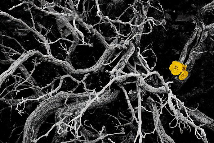
While everyone else was staring at the rocks and sands of Death Valley, I was drawn to the gnarled shrubbery and bright spots of color on the flower-dotted sides of some of the higher alluvial fans. I saw this as a black and white/color composite when I took out the camera, and this is what I managed to create when my processing efforts were finished.
Specific Feedback
I’m just looking for general feedback. This image is represents a much higher level of processing than I typically pursue in my photography, but it was fun to be more of artist than a landscape documentarian for a moment. I see some technical issues that are pretty hard for me to resolve, and I’m not sure the high contrast approach to the majority of the scene is the right path here, but this one still makes me stop and think.
Technical Details
So, the base settings were 100 mm at f/11, ISO 400 for 1/160th second. The sky was overcast and it was fairly windy. I used focus bracket to capture a total of 50 images with very slight shifts in the focal distance. After some general touchups in LrC, I used Helicon Focus to blend the images into a single frame, then used Nik Silver Efex Pro to convert the frame to black and white. Back to PS for a fair bit of dodging and burning, especially to darken the non-woody areas of the ground, then finally brought in on e of the original frames with the yellow flower in best focus, and manually masked the yellow areas into the black and white. A quick run through Topaz De-Noise got me close, but then I found several areas where very small twigs were not in focus (especially a couple that must have been closest to the camera). So, I used the spot healing brush in PS to try and clone these areas out. This is where I can still see some less than perfect technical work; hopefully it is not as noticeable to you, but pixel peepers will probably be disappointed.
