Critique Style Requested: Standard
The photographer is looking for generalized feedback about the aesthetic and technical qualities of their image.
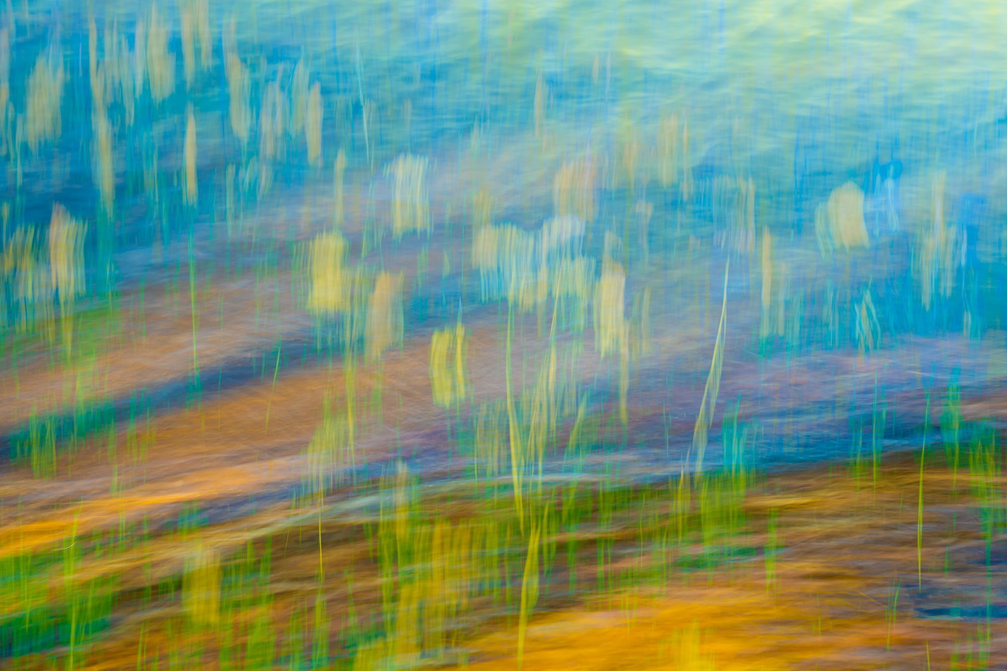
Description
This is a blended image of 2 ICMs
Technical Details
2 different images
Critique Style Requested: Standard
The photographer is looking for generalized feedback about the aesthetic and technical qualities of their image.
This is a blended image of 2 ICMs
2 different images
Wow Mario, this is a very attractive image you’ve created. I never would have believed Queen Annes Lace could be so colorful, because around here (CT) its usually white along the roadsides, but I’m sure there are other varieties with different colors. So, I’m attracted to the yellows, greens, turquoise, and tans, a very pleasing combination. Also, your composition has them fairly evenly spread out without any large “dead” spots, plus the diagonal lines in the BG works nicely with the vertical lines of the plants. Nice work all around!
Hi, Mario. You went for bold colors in your composite. I think it works very well with that color scheme. One thing I really like in your composition is the juxtaposition of the diagonal and vertical lines. That creates a nice pattern to give viewers plenty to explore. What I find very intriguing is that the photo caption gets me searching for those flowers in this composite. Nicely done.
Lovely image Mario! I quite like the colors, the low contrast, and interplay of lines in your final image. I love the brush stroke like impressions of the flowers.
Since photography is about what’s excluded as much as what’s included in the frame, I think you did well on your overall composition. One suggestion I would like to offer is to tone down that colorful strip at the bottom. That can be done by either desaturating the warm color or by cropping in slightly.
Mario,
Great job combining the two images to produce this abstract. I think it works beautifully.
Now I’ll be the first to say, and have said before, abstracts give us the opportunity to stretch things like colors, hue and saturation. There are no rules when it comes to abstracts. Having said that, we all still have preferences and favorites! And so I’ll have to be honest here that I’m not a fan of the cyan here or the saturated greens. I’m all for taking liberties and will do so myself. I think here though, that the colors are taking away from the abstractness you have created by combining the two images. I think the combo result is engaging and fascinated. I’m just not enamoured with the colors, I think.
As presented, I could see burning down the upper right a bit and also toning down the yellow/orange at the bottom that Alfredo previously pointed out.
I can’t say I’ve ever combine two ICM’s… gives me something to think about. Makes me wonder how in the heck one would determine which individual frames to combine with another… food for my own thoughts.
Lon
Hi Mario,
Wow, what a lovely colorful image! Whether it’s truly Queen Anne’s Lace or not, it’s a lovely combination of the two ICM’s. I am jealous of other brands of camera that can combine them in camera, as I want to know whether my idea works or not before I leave the scene, but like you I have to combine them later and hope that my idea worked! Doing horizontal and vertical ICMs combined creates a wonderful implied texture very often, as this one does. I agree about toning down the yellow swipe in the lower right area, it’s bold and the eye goes to it as it’s a rather large swatch of yellow. But overall, this just has such a nice feeling to it, a job well done!
Thabnk you all @Jim_Lockhart @Lon_Overacker @Alfredo_Mora @Egídio_Leitão @brenda_tharp for your time and comments.
Brenda I also am jealous of those with in camera double exposure, the Sony’s do not allow that…so PS is necessary to do this.