I had great plans to use the new port I’d just gotten for my water housing. I’d waited for over two months to get it and I was excited to take it out for a spin with my 85mm and try a few abstract shots under low light conditions.
I got to the beach early, about a half hour before sunrise and realized it wasn’t going to happen. The Invasion had begun. I’m used to seeing the Sargassum seaweed levels increase at certain periods of the year but this time was different. There was tons more seaweed in the water and along the beach than usual and it lasted for most of the year. After making a few failed trips during the first month I decided to try and make the most of the situation and gave up on shooting from the water. As one of our local sayings goes “If you don’t have horse, ride cow”. For the first two days the cow seemed to be acting more like a bull and I was in for a wild bronco ride. It took me a while before I found anything I liked. There are a lot more limitations when I’m shooting from the land especially when it comes the position and quality of light.
By the third session I had a better idea of what was happening around me, like how the waves were breaking and how they interacted with the light.
My goal was to create a set of images that portrayed the Sargassum in various situations and try to make something visually interesting from an otherwise bland scene.
I ended up using my 70-200mm for most of the images and used ND filters for the longer exposures.
Self Critique
My goal was to create a set of images that portrayed the Sargassum in various situations and try to make something visually interesting from an otherwise bland scene. I’m always looking for new ways to create images and I try and step out of my comfort zone. I liked that I was able to find a way to balance the variety of images but still manage to have an overall theme. I think this is one of the trickiest things to achieve with projects. There are a few images that don’t fit as well as others but I tend to prefer erring on the side of diversity than having them all look the same. Maybe that will change once I get some more projects under my belt.
Creative Direction
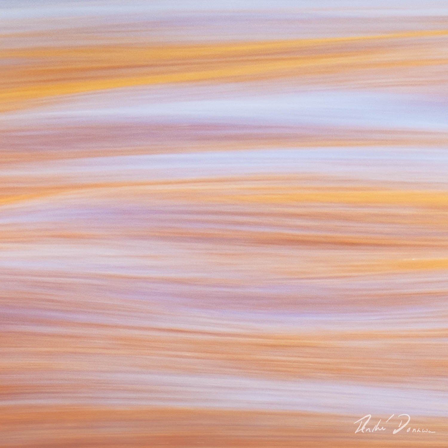
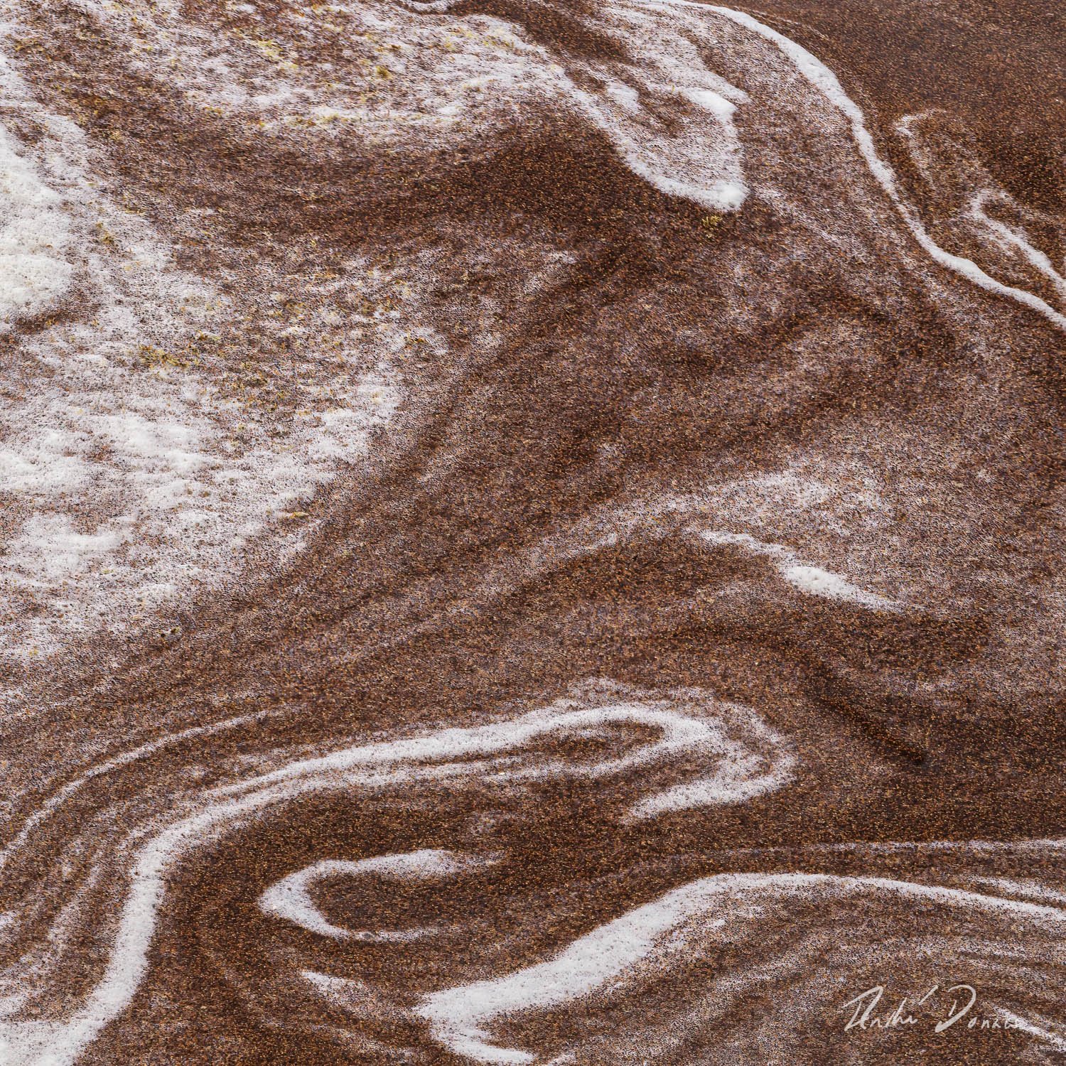
When I was taking the images, my goal was to explore different ways of presenting a simple subject, Sargassum in the waves. I used long exposures with ICM and also tried fast shutter speeds. Except for "Mocha " the images were taken over two consecutive mornings. It was a great challenge trying to format them for a project. I decided that a square crop would work best overall since I had a few that were originally Portrait or Landscape. After cropping the images, I picked out 12 from my first selection and used the survey mode in LR to see if I could formulate some type of narrative. Emotionally, I was going for a bright upbeat vibe overall, but I also wanted the viewers to be curious. I could have stuck to one style like the LE’s but I felt that would have been too repetitive.
Things that the images have in common.
Subject matter, Sargassum in the sea
Relatively tight crop
Yellow and blue colour scheme
A sense of motion
Lines
Square crop
Differences:
Abstract vs more realistic
Long exposures vs fast shutter speeds
Dynamic range
I chose the first image as my opener because I liked the colours and I thought it encapsulated the overall theme.
The last image shares similarities with the composition of the first one.
The colour scheme of the project overall goes from yellow to blue.
The opening images are brighter and they get darker in the second half.
The first set of images are more abstract and have longer exposures.
In the middle there is a stark shift between the brighter “Wild Ride” and the darker “Natures Mocha”
It also signals a change in the colours and dynamic range.
I’m sure how much of this comes off when someone is going through them for the first time but I’m looking forward to hearing everyone’s views.
Specific Feedback
Aesthetic: Feedback on the overall visual appeal of the project.
Conceptual: Feedback on the message and story conveyed by the project.
Emotional: Feedback on the emotional impact and artistic value of the project.
Technical: Feedback on the technical aspects of the images in the project and how they work together. A few of the images I would have liked to have used other camera settings. Some of them were my first test images and even though they where not as technically ideal as some of my later ones I much preferred their overall aesthetic.
Intent of the project
Additional Details: I’m open to exploring all of the options outlined.
I’ll start with my website gallery and work my way through the rest.
Alternate Images
Please provide feedback on whether any of these images would fit more cohesively in the project.
Good morning Andre. First of all, this is a wonderful project! I can absolutely see myself stepping into a gallery to view…I know I would enjoy the beauty you have presented and learn about sargassum.
This is my first project critique and it is a bit daunting to take on so I hope my comments can be useful to you. I hope you don’t mind if I present my thoughts in bullet form…I think I can be more succinct that way:
*I like the consistent crop and bright colour scheme you have used. It seems yellow is a commonality that works. (I think that is why I don’t think Mocha #7 works as well)
If there are photos you find not “technically ideal” chances are your viewer will feel the same. I personally find #7 and alternates 1 and 6 more out of focus than abstract ( am curious what ones you find not technically ideal)
My favourites are the ICM and # 10 which has a beautiful balance of abstract and realism as well as the colours. Among the alternates I would consider using #3, 4 and 5
I really like the water box image at the end as I surprise of what you have been photographing and made “more beautiful”
Again, I think this is a wonderful project. Best wishes!
Andre, this is a stunning collection of images. I’m not experienced enough with project to offer any truly valuable feedback on that aspect, every one of these photos can stand on its own! I particularly enjoy the ICM images. The texture you’ve been able to bring out in them is amazing! I’d be hard pressed to pick a favorite but I think I find the first holds my attention the most. The contrast between the cool blues & warmer orange/yellows works very well together. The breaking crest of the wave adds a great sense of action & allows the viewer to fell the motion implied in the frame.
For the non ICM photos, Independence Wave is my favorite. Once again, the cool/warm contrast works very well. the diagonal "bulge of the water from mid frame to URC helps split the frame while the streaks somehow suggest teeth to me. I’m sure I’m going to find myself coming back to this set again & again & I expect to find more in all of the frames that I like. Excellent work!
Hi Andre. These are all very nice images but I want to comment on the project as a whole rather than the merits of the individual photographs.
I see two problems with this series that could easily be addressed. First, is the order in which you’ve placed them. Looking through the grouping it almost seems to me that you have two separate groups. The first five images are all the same colour palette and tone and then there is a dramatic shift from Image 6 onwards. I think you could use most of the images you’ve posted but I’d be a little more thoughtful as to how they’re sequenced so that that they flow more fluidly such that each image informs the one that precedes and follows a little more coherently. The second problem is, I think, a difficult one for most of us to address both in our individual images and, especially, in series, namely editing. For example, Images 1 through 5 and particularly Images 2, 3, and 4 are very similar to the point where I find them repetitious. To be clear, I think as individual images they are all excellent but in a group, particularly 2, 3, and 4, they repeat more than inform. So, I would suggest picking one of, say, the three and then work the rest into the whole group in a more integrated way.
I hope this is helpful.
@Diane_Miller@Kerry_Gordon@Kris_Wyman thank you for the comments. @Kerry_Gordon do you have a particular order that you think would work better. I realise the choice of images and their particular order is a subjective thing but I’m always open and in fact look forward to seeing different peoples perspective on a given subject. I think this one of the things that makes projects so challenging.
Hi Andre - I have somewhat the same thoughts as Kerry as the first five being repetitive. It does feel as if there are two series here - slow-shutter abstracts and non-slow-shutter abstracts. There’s such a different feeling between the two sets it’s rather jarring. In answer to your question, yes, the changes in color/luminosity between them is noticeable.
For me, #3, #5, and #7 are the weakest.
I could see choosing one of the slow-shutter abstracts (#1) and eliminating the rest, while including alternates 1 and 5. I didn’t know what sargassum looked like, and those two images are quite interesting to me because it puts the more abstract ones into context. But that could just be the scientist, not the artist, in me speaking.
At any rate, this is a very cool series. I love the colors!
The best way to find an order that works is to print the images out and lay them on the floor so that you can move them around, just as you might do if you were creating a gallery exhibition. It’s hard to pick an order when I can’t move them around. That being said, maybe: 2, 10, 9, 8, 11, Alt 6, 5, Alt 4, 1, 3. I have left out a number of images because they don’t seem to fit for me - images 6, 7 and 12 Image 7 and 12 don’t have much sense of flow and image 6 doesn’t seem right colour wise. But, for example, I’d definitely put images 8 and 9 together because of the way the frame is divided in both cases - texture on top, flow on the bottom. And I think, image 2 (which is my favourite and therefore the one I’d tend to start with) goes very well with image 10 because, though the colours are different, there is a similar flow and softness. So, that’s how I’m thinking about it when I’m putting images together. If there are two images that are quite different and I want to include them both, I’ll try and find other images that will help bridge the gap maybe by moving the colour slowly in a certain direction or the texture so that I can get from, say, image 2 to alt 4 without giving the reader whiplash
What a great set of images, I like them a lot! However, I will not comment on the images itself but only on how they form a project. First, let me state that I have almost no experience regarding photo projects so my comments are just based on my present opinion not backed up by any experience.
I like that you have aimed for diversity regarding the images to include. The goal to “explore different ways of presenting a simple subject, Sargassum in the waves” and your aim to engage the viewers curiosity back up and even imply such a choice in my opinion. My thinking is that the first 4 images and the additional image No. 3 are very similar and then could become the backbone of the project guiding the viewer through the project if these 5 images are evenly distributed throughout the image sequence with say two diverse images placed in-between. One idea is then to place the images with blue water (No. 1 and additional image No. 3) at the beginning and at the end of the image sequence.
That would become a project of 13 images with the sequence as shown in the image below.
Thanks for the feedback @Bonnie_Lampley@Ola_Jovall@Kerry_Gordon .
My original feeling was to stagger the ICM images throughout the project to avoid repetition but I was trying to go along with the flow concept outlined in the guide. At least my understanding of it. I prefer having them more interspersed as you all have suggested.
@Kerry_Gordon I wanted to print them out but my printer is down at the moment, so I’ve been using the survey mode in LR. I miss having the physical prints to play with. Thanks for the suggested image order.
@Bonnie_Lampley maybe there’s an artistic scientist in the middle ground somewhere
@Ola_Jovall Thanks for the reminder of what my goal was with the project. I like suggested order.