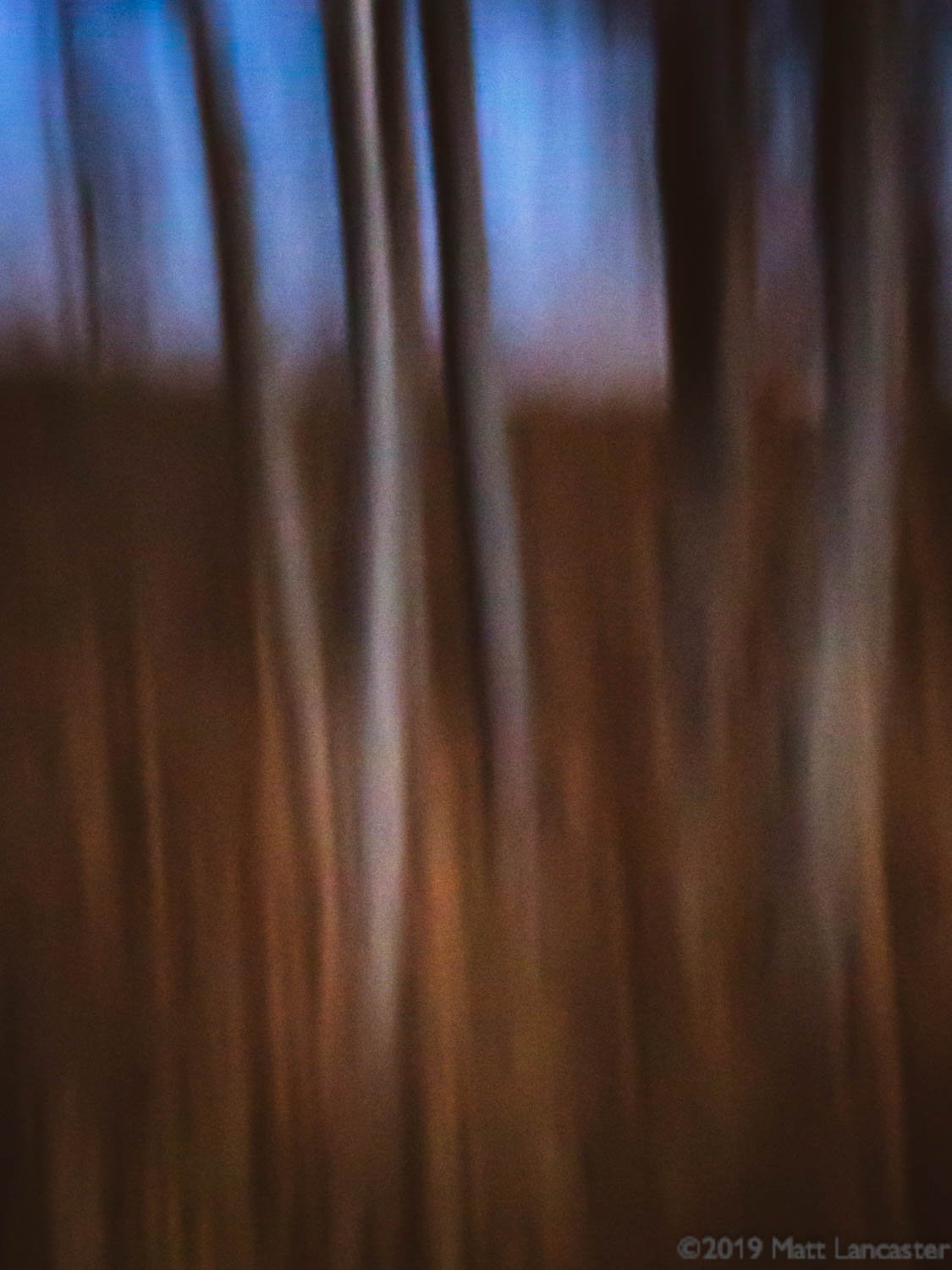
I experiment with In-Camera Motion (ICM) blur quite a bit, especially with my phone, although it doesn’t allow for the high degree of technical control like a DSLR does. The results are what matter though.
I think the attached set of 3 images work well for their lines, color gradients, and compositions although perhaps the phone sensor is just not up to the task for image quality, but let me know what you think.
What technical feedback would you like if any?
Any, particularly regarding color processing, texture, and grain since those are relevant to ICM images.
What artistic feedback would you like if any?
Any.
Pertinent technical details or techniques:
Shot with Adobe Lightroom Camera App on iPhone 6s
Images 1 and 2:
f/2.2
1/3 sec
4.15 mm
ISO 500
Image 3:
f/2.2
1/3 sec
4.15 mm
ISO 800
All images processed in Lightroom
If you would like your image to be eligible for a feature on the NPN Instagram (@NaturePhotoNet), add the tag ‘ig’ and leave your Instagram username below.
Very creative and abstract! I am not a motion blur specialist but the first and second caught my eye more than the third one. I like the pastel colors reminds me of chalks. I could see them hanging in an entry way to modern/contemporary home in large format.
I’m not much of an ICM guy (seems like I’m always chasing sharpness ), but I always try and comment on the five prior topics when I post so here goes.
The first two have great color, and look like fine examples of ICM to me. The third is harder for me to recognize as ICM, and has more subtle color. Interestingly, I prefer the third because of that. It has a mystery to it that I enjoy, and the limited color palette adds to that mystery.
Thanks, @John_Williams. I appreciate your comments. I’ve been guilty of chasing sharpness as well, but i don’t want it to limit my options so I turn to things like ICM. Ironically, a sharp ICM is a thing of beauty and I don’t think any of these 3 are particularly sharp.
I also appreciate your preference for the third as I do too for the abstraction and mystery as you mention. I processed it to add drama through color gradient and shadow. Glad you like it.
My comments are in line with those by @John_Williams, I think the first two are fine examples of ICM, and I’m not as enthused about the third image since it is so dark in the negative space at the bottom. The first image is my favorite, it has a very pleasing mixture of warm and cool tones, and bright and dark areas
For this type of ICM, I think the phone does a reasonably good job, especially if you didn’t have your real camera with you at the time, this was the only way you are going to get these images.
Lovey images. And a great sales job for LR phone app!
All of them are very nice. The first two seem to have noise or grain. I am not sure of the difference. I do wonder if it is noise and you removed in in LR it would further soften the images would this add or remove from what you prefer?
The third is also my preference. It seems to have a nice “heavy” ballast bottom and upward flow reaching up to the soft colored light.
Thanks, @Ed_McGuirk. I agree, the phone does a decent job, and I only use it when I’m out and about without my DSLR. I think processing can take care of some of the inadequacies with phone-derived ICM.
And thanks for weighing in on your preference and the reasons. It is clear that everyone has their own opinion, and that’s a very good thing.
Thanks for your comments, @David_Leroy. I’m not sure if a softer image is a bad thing and I’d be willing to remove some more noise and see what happens. I might actually like it, but I don’t mind the grain in the first place. I keep an open mind about these things and avoid expectations because they can be very limiting.
I think in this case, image quality may very well come back to the sensor and device used to record the image. The iphone just can’t do the job of a DSLR and I push it to see what it can do. I’m reasonably happy with the results with these three, and if I find inadequacies in the image, I push the processing to see if I can still get a pleasing result.
Enjoying all these. I myself have been having fun with these for a while now and I’m really fascinated and enthralled with the whole process - from creativity at capture and then having fun with the results. Ironically, I find these images require little to no post processing - other than standard dust bunny cleanup, cropping, etc.
The great thing about the ICM creations and processes is that they each become so different than the next - yet have so much in common with lines, colors, shapes, motion, etc. etc.
I will say the first and somewhat the second do suffer a tiny bit from the phone quality. It’s not so much a softness, sharpness thing… I think just not up to part with what the dslr can do. Except of course, this is abstract… and with that, all those rules and niceties go out the window. So it’s still enjoyable viewing these.
I think the third is my favorite. Less obvious of ICM as others have noted, but is a great example on the great potential of this. There’s a great mystery and intrigue to this last image; the simply color and light structure… love this one. I could see cropping just a tad off the bottom, but that’s more in line with personal choice.
Thanks for sharing. Glad to know there are others…
Great comments, @Lon_Overacker. Yes, there are others of us out here to really enjoy ICM. I’ve been experimenting for years. A friend gave me the gift of a book of ICM photographs many years ago that legitimized it for me. I have since misplaced the book, regrettably.
Processing the images, as you say, is not a matter of optimizing the traditional aspects of histogram tones, contrast, sharpness, etc. Optimization is about a personal vision, and every image is just so different than the next. In some cases, little work is required and rules are meant to be broken, if any apply at all.
In the case of these images, in the first image I cropped quite a bit, darkened the exposure then brought out those parts I wanted to; the second image took quite a bit of work - I brightened the light tree trunk, darkened the middle vertical third of the image, and brightened the right vertical third, plus added a little vignette; in the third image, I worked it quite a bit to produce the colors, depth, and light values I wanted. I know everyone isn’t a fan of dark areas of images, but I am; they add mystery and drama.
Very pleased to see the wide range of responses. Thanks to all!


 ), but I always try and comment on the five prior topics when I post so here goes.