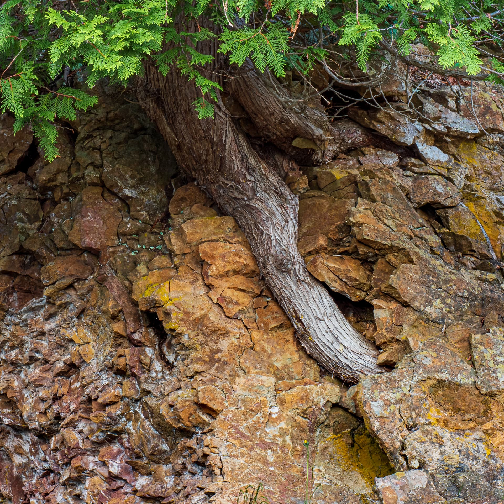
After reading @Matthew_Chatham’s comments, I went with a square crop, changed to Adobe Landscape profile, further desaturated greens and upped the exposure on the top of the tree trunk just a bit -
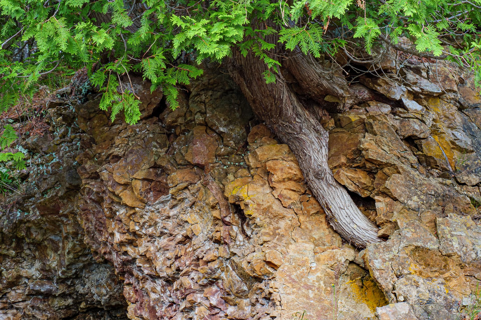
I often find the best stuff just behind me. One of the first things I learned about landscape photography was “Turn Around”. And this is what I found.
The light wasn’t great so I have been sitting with this in Lightroom for weeks looking at it and tweaking it and still not being at home with it. I’ve played with most of the sliders on this one and I’ve done it as a monochrome, but it needs the color to work.
Specific Feedback Requested
Really peeps…chime in. I’m open for suggestions. Maybe I’ve just been looking at it too long and can’t see it anymore.
Technical Details
Is this a composite: No
Shot like this
Processed with Lightroom for a crop and a lot of gradient and brush tools to even out the lighting - there was more shadow at the top, and I didn’t eliminate that completely, but I did mitigate it quite a bit. Also color sliders were moved - green pulled down in sat & lum, orange & yellow got intensified. Texture added, but no clarity because it seemed too crispy that way.
Oh and it’s a 5-shot HDR blend - I forgot that it was when I first posted.
This is an interesting observation that I also find to be true. It’s not that I’m missing out on what’s behind me, though. It’s that it puts me into a fresh new state of mind and things once again look new and wonderful. I’m big into state of minds when it comes to photography. How it has this ability to transports you internally by what you see.
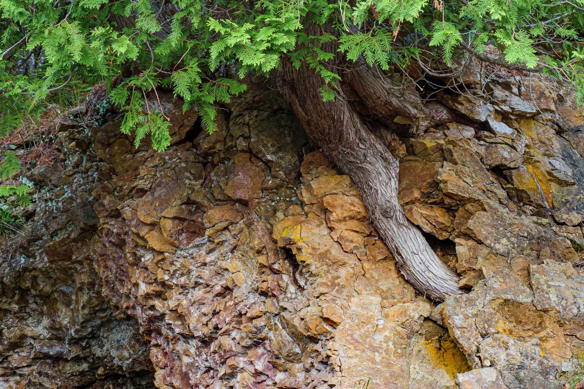
The bright greens on top really dominate this image and makes me feel that it’s unbalanced.
Glad I’m not the only one spinning in circles. Lol. But it really does snap you out of a rut if you can’t find ‘the shot’ if you know what I mean. Plus it opens new ideas and subjects, so I always try to remember to do it.
You’re right about the greens. I’d already taken them down, but I went further with another try.
You never know what you’ll find when you turn around!
These are some really interesting trees, the way they grow seemingly straight out of the rock. So I think I understand what you were going for in this shot, but something feels off to me. Maybe either getting further away or getting in closer to the tree could help. I could see a dramatic image, maybe a silhouette, of a tree growing out of a cliff face. Or I could also see getting up closer to the trunk on the right-hand side of the image you have here and emphasizing the contrast of the wood growing out of / around the rock. As it is, I feel that the composition doesn’t serve the subject as well as it could. Those are just my thoughts, and I may have misunderstood what you were going for!
I like the rework much better. In the original post, it wasn’t clear to me if you wanted to emphasize the tree or the rocks, and I think the rework distills this down to a much more focused study of the tree. The tighter focus on the tree also makes the diagonal line of the tree root more powerful visually. The rocks still play a good supporting role in the rework.
That’s not to say the rocks aren’t interesting in their own right…
I like the square crop the best, as it highlights the root, and the root has better proportions in the frame. I tried taking your last edits a bit further - increasing the exposure and contrast (by dodging/burning, not the contrast slider), desaturating the greens even more, and changing the hue of the root to be a bit cooler, so that it contrasts more with the strong yellow rocks. I know you like bold colors, but the green, to me, is just so overwhelming in this scene - it screams for my attention. So, see what you think. I may have taken the greens down too much, but the muted shade seems to match the mood of this better (for me, anyway).