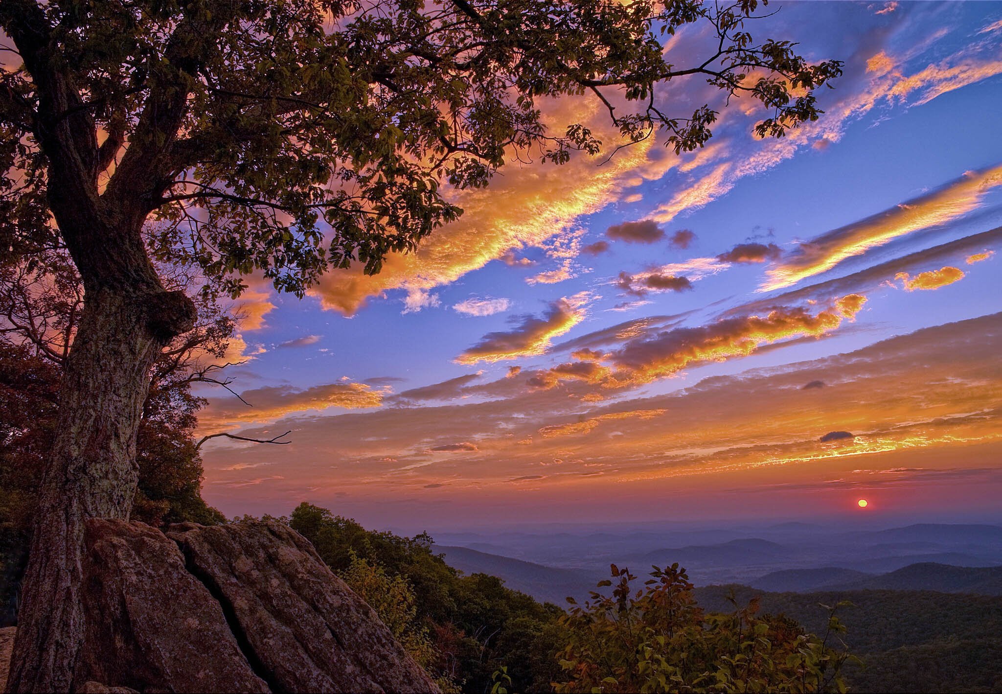
My wife got up early and waited with me for this sunrise. She got a nice breakfast afterward, nice memory.
Specific Feedback Requested
All feedback is welcome.
Technical Details
Is this a composite: No
Nikon D700, 24mm, f9, 1/60th, ISO 100
My wife got up early and waited with me for this sunrise. She got a nice breakfast afterward, nice memory.
All feedback is welcome.
Is this a composite: No
Nikon D700, 24mm, f9, 1/60th, ISO 100
I like the composition and the idea of this image, but wow, those colors are really hot. I can’t see beyond them. And the highlights seem to be blown out in the clouds and underplayed in the sun itself. Maybe tone some of that down and see what you think. I’d also take a look at the fg rocks and trees and see about bringing up the exposure there. Right now it’s just too jarring for me. The far hills are enticing though!
I like how the clouds, branches, and even the rocks all flow out of one point. That’s what makes this image for me. To be honest, the sun itself seems fairly unimportant to me. You could try to bring out just a bit more texture from that llc in both the bark and the rocks. The blues are pretty strong but for some reason they seem to work well here. I would crop just a fraction from the bottom perhaps.
I really like the composition especially the leaves against the clouds. The sky and clouds do seem over saturated to my eye/taste. however.
Thank you Kristen, Igor and Mario. I think the consensus is correct - I can reduce saturation a bit. Great to have these different eyes on it!
That’s a lovely sunset Jim. I do agree that the saturation got away, but that’s an easy fix. I find that blues seem especially sensitive in shots like these; you might try reducing the red/yellow saturation some, and the blue a bit more. It may have a slight CCW tilt?
Thank you for the help, John. Glad you liked it.
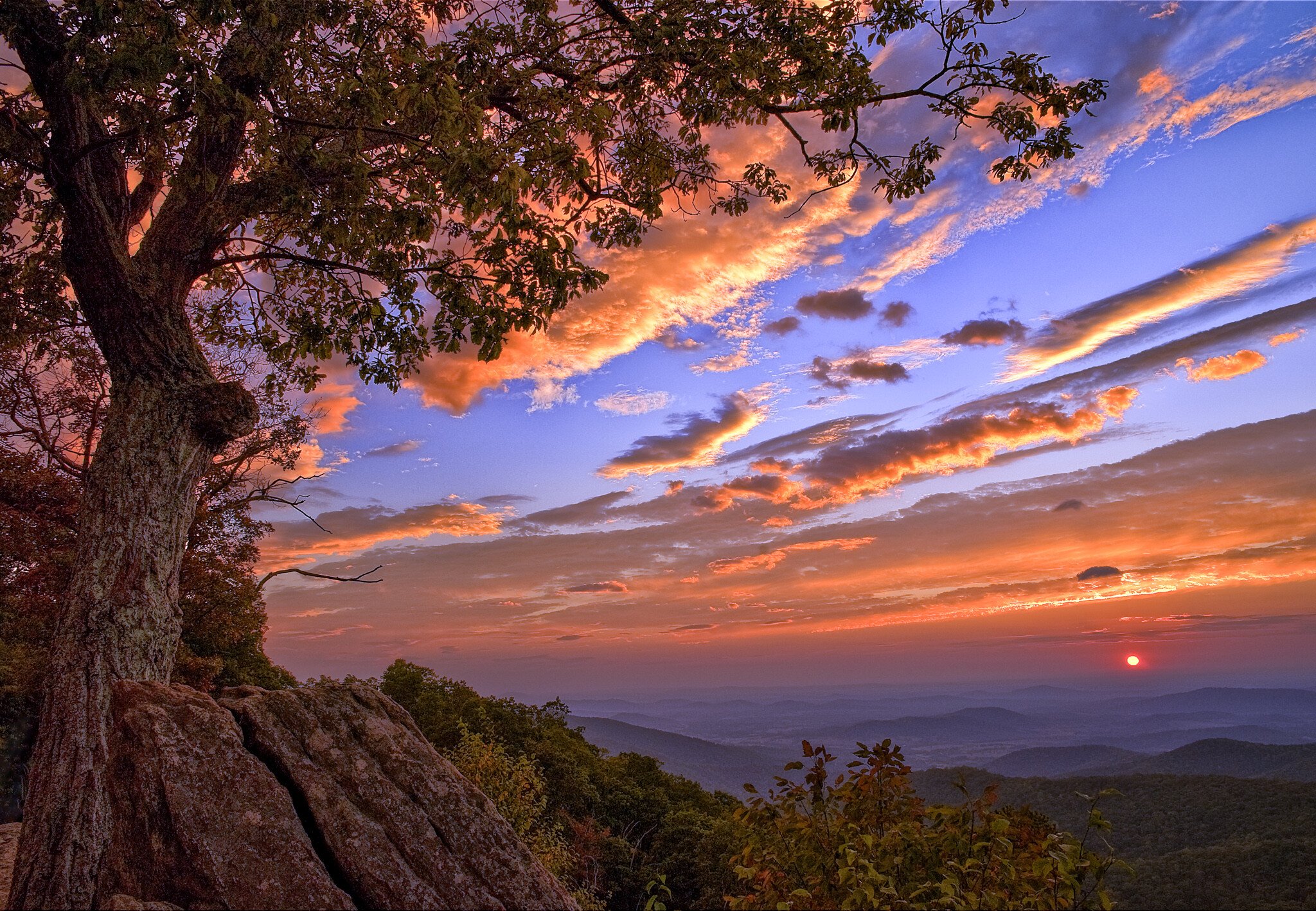
Jim, this is a really powerful composition. I love how all the lines in this image radiate outward from the lower left corner, and pull the viewers eye from left to right. I like where you placed the sun as well. I agree that the sky saturation has gone too far. I also think you could reveal some more shadow detail in the foreground. And the shadowed foreground looks a bit too warm, in real life shadow areas are cooler. Here is a rework I did that illustrates these comments. I used TK Action Luminosity masks to make these changes. I used a TK Saturation mask to reduce saturation in the most saturated colors to address the sky. One of the results of reducing saturation is the blues in the sky have more luminosity, which I think is more natural looking. I used a TK subtracted Luminosity Mask (Darks 2 - Darks 5) to lift foreground shadows without losing contrast. I then applied a cooling filter thru a TK Darks 2 mask to cool the shadowed foreground. Here are the results. Some folks might even argue that the sky saturation could be reduced further beyond my rework, but then it gets into a more subjective vs. objective realm.
Thanks Ed! You did a great job with this. I will work with my original to try to get closer to this. Great help.
Okay, folks, here is my latest effort. Perhaps still not as good as it should be, but I think it is a lot better than my original post. Thank you all for helping me improve a shot I really like.
I like the dodging that was done but some of the power of the image has been lost due to the desaturation. And it’s not only in the sky but on the rocks as well. It just feels watered down. Maybe something between this and the original. Oh and btw, it’s quite noticeable where the tree was dodged and where it was not.
Interesting, I didn’t do anything to any specific part of the tree. But you might be right, Igor, perhaps too much reduction in the saturation. Just a touch more may be perfect. And I think a touch of contrast. Thanks!
excellent image. The foreground is well lit with excellent detail. The composition is compelling, exciting and tranquil all at the same time. Colors fabulous. I love color and saturation, but do agree that a little less could be more.
Jim,
First of all, welcome to NPN! Great to have you here and a beautiful first post!
Before getting to the color/saturation, I just want to say that the composition and set up are wonderful. Just enough of both the foreground, tree and canopy to frame and provide location context - yet this is still all about the dynamic and beautiful sunrise!
As far as the saturation goes, IMHO, the reworks have gone too far, well partially. I think it is primarily the blues that are more electric and over done. However, the oranges are closer to believable - at least for me. I know each and every one of us has witness countless sunrise/sunset scenes and marveled at the colors we see with our own eyes - and then have the corral that when reviewing those scenes on the computer - often times having to back off on colors that come out of the camera. And of course there is the variable of personal preference, etc. Any-who, I think there is something in between the original and re-worked images.
Regarding this - it appears to me that this hints of the use of a graduated ND filter? The original image also shows the difference in shadow luminosity of the main trunk bottom to top; I think it just became more pronounced when elevating the shadows of the foreground. But still, not sure why the top tree trunk is much darker - could be natural, given shadows. No biggie really given the dynamic and gorgeous sunrise scene.
Looking forward to more! Welcome.
Lon
Hi Lon, Thanks for the kind welcome. Much appreciated. I’m still getting used to how to navigate the site. But I love the excellent feedback on my posts so far. Good chance you are right about the Graduated ND, but not sure as the picture was a little while ago. I also agree we are reaching a matter of personal taste on the saturation, but I tend to think that the transgression is more often on the over vs. the under, at least for me if I am not careful.