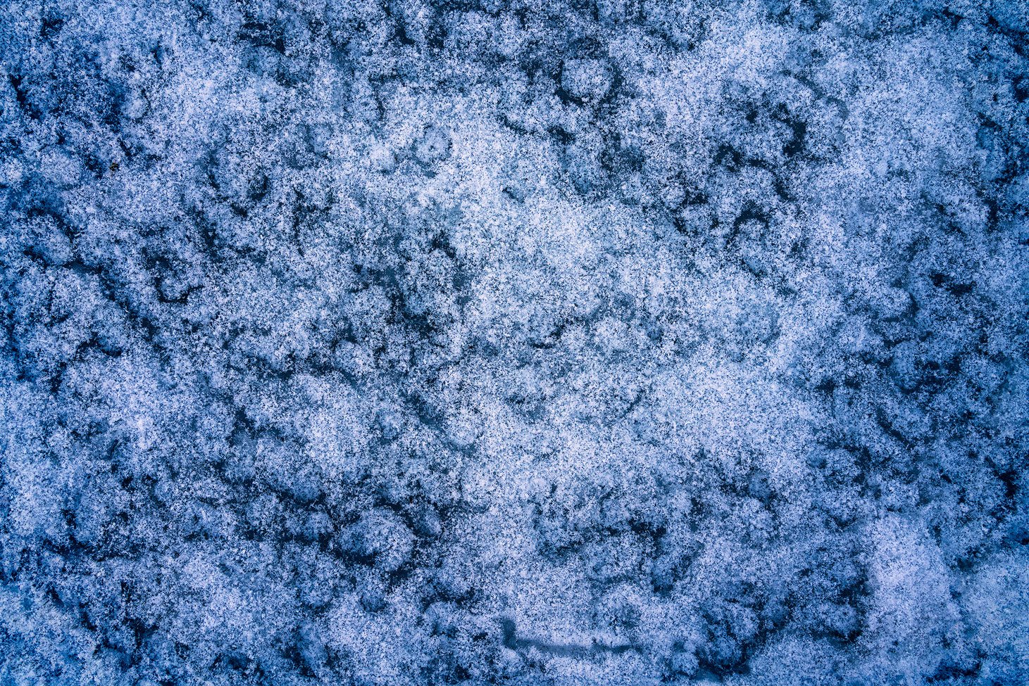
I took this while I was out for a short hike this weekend. I like to go out early before the little guy wakes up so this was taken maybe 5-10 minutes after sunrise down in a frozen creek bed. The ice was rough so little pockets of snow would catch and build up leaving the cracks between where the dark ice poked through.
Specific Feedback Requested
I am interested in scenes like these but I also find them challenging to compose. It is almost like you could point your camera anywhere and get something similar, but not the same, so does this work better than another, who knows! I was drawn to the larger structure of snow just off from center.
In my processing I tried to accentuate the frozen feeling - it was about 12 degrees when I was out and the steam coming out of my mask was freezing to my hat to give you an idea! I also worked on brightening up the snow pockets a bit and darkening down the ice a touch.
I also focus stacked to focus on each of the four corners and the center of the frame to try to get as sharp as possible.
Technical Details
Is this a composite: Yes
I also focus stacked to focus on each of the four corners and the center of the frame to try to get as sharp as possible.
No mystery why you were attracted to this little slice. I like your choice of what to include - you’re right about getting similar, but not identical images. The larger bit of snow breaks up the same-ness pretty well IMO. I like the processing as well. Other than dividing it up into smaller scenes for a collage or triptych, I’m not sure how you could improve this larger image. The lights and darks aren’t too extreme and neither is the texture/clarity. Overall I find it harmonious.
This is a fine intimate abstract scene David, very nicely done.
This is true. But you recognized a good element to anchor the composition in the white patch, and wisely placed it off-center. You also avoided a common pitfall with these types of images, there are no significant distractions along the edges. But to me the most interesting aspect of this image is the dark mottled pattern of the cracks, and your processing of contrast and color has done a great job of accentuating that pattern. Lots of interesting patterns and texture here, great find…
Hey Kristen…first, welcome to the crew! Thanks for the thoughtful comments. I selected that patch of snow for the very purpose you suggested, there were other areas where it all looked the same and this patch broke that pattern a bit. I was able to get the image about 90% of the way to where I wanted it in LR but I had to pull it into PS to get some luminosity masks to target those dark icy areas and the withe snow separately and then do some sharpening. I appreciate ya taking a look!
@Ed_McGuirk I appreciate the comments! I took special care along the edges to try to avoid anything that looked off. There was one dark section in the upper left corner where I cloned out an icy streak that was cut off at the edge and cropped a little off the sides to get just right. The dark pattern is exactly what pulled me in which I tried to emphasize (along with the cool color) in processing.
David, I love abstracts and this is a great find! I keep finding new things to see in this and I love the mystery of the scale. It could totally be a drone shot! I definitely feel the cold / frozen feeling. I share your in your challenge in composing these abstracts. Caveat - I am by no means expert - to my eye, the blues are a bit more saturated around the edges of the frame which I personally really like. It’s almost like there’s a gradation from the whites, to blues, to deep dark blue / black. I feel that that element is not as prevalent around the center white patch that is the main focus. Adding that in those areas if possible (like right dead center) would bring more contrast to the white and make it appear brighter if that’s what you are going for in terms of focal point to the composition. It’ s a great shot as is though! Kudos!
@Dan_Wood thank you for the thoughtful comments. It’s funny you say that about drone shots, I’ve really been into the arial images from Hans Strand and some of the work from Kai Hornung. I wasn’t thinking about them while shooting this but maybe it had some impact! The blues on the edge are more saturated, it wasn’t really intentional but while brightening up the center it probably reduced some of that saturation a bit. I gave it another crack and added some of that back in to see if it balances out a bit more and gives some extra weight to the middle portion of the image.
Nice rework Dave. I think the whites pop a bit more and, to my eye, you achieved more balance. I’m also a huge fan of Hans Strand. Not a bad couple of artists to subliminally influence you!