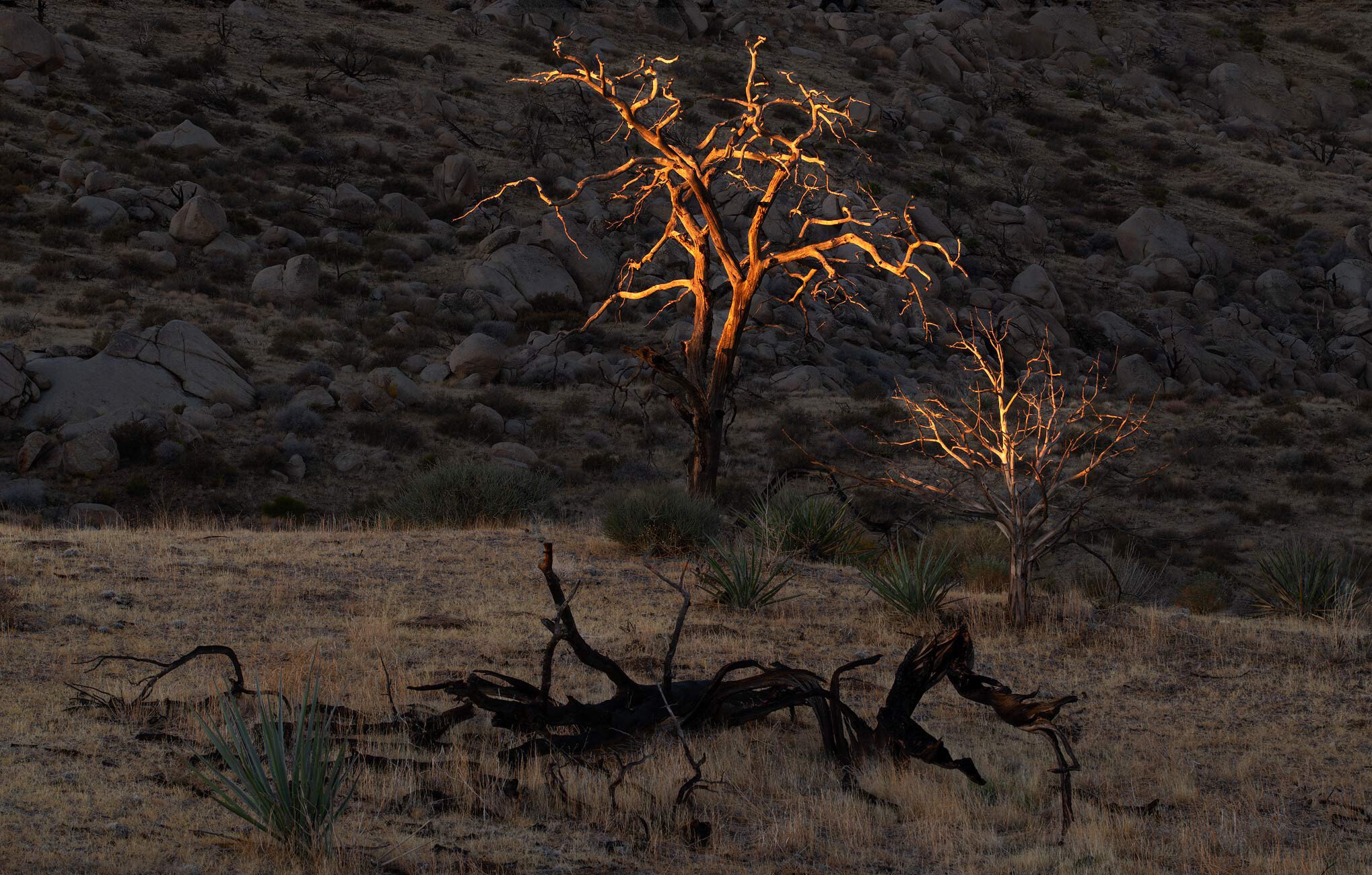
This is another image from last Wednesday morning in the Mojave desert. The downed tree speaks to the firestorm that burned through this area 15 years ago, completing consuming some and killing others. 100 yards from this spot is a grove of thriving juniper and pinyon pine.
The light here, is remarkable, Harley. I think a 4:5 or even a square crop would make the image that much more dramatic. It feels to me like the three central elements - the two highlit trees and the dark branch in the foreground are getting a short shrift by more of that grey-toned background than is needed.
Harley, wonderful light once again on this last trip to Mojave area. I’ll buy in on Kerry’s crop ideas as other options to see what you might think. If you like the larger view the only change for me is to add a tiny bit of canvas at the bottom. Maybe a CA or cloning that grass area to give the green bush some room at the base.
Regardless, the scene is there we never seem to run out of optional thoughts on post processing ideas. Always good thoughts overall…
I like the focus resulting from the crop. Might be just me, but the very bright limbs and the dowdy light on everything else seems unnatural. Probably just what the camera saw, but I’ll be when you were there, your brain integrated the unlit areas as brighter. If brighter, at least in areas, it seems that the foreground downed tree and the agave lead a bit into the trees, tying things together a bit. But maybe you prefer to emphasize the contrast, as the desert is rarely a subtle place.
Thanks for the rework, @Dick_Knudson ! Funny, my original processing had a lighter background and I decided to darken the back rock to emphasize the light on the trees. So many ways to interpret an image!! Your thoughts are very much appreciated.
Really fine work Harley. The concept of the lighted tree in the darkness is great. And it’s that reason I might like the original over the rework, which is a stronger composition. You need lots of darkness and a smaller amount of tree to make the statement. I think it’s the centered look which weakens the original composition. Here’s a small crop to deal with that.
I really like this, Harley. I just love the little bit of light shining on the top of the branches really making them stand out. I like the dramatic contrast between the dark around it too. I think I like the original better because it more emphasizes the daylight breaking on the whole landscape.