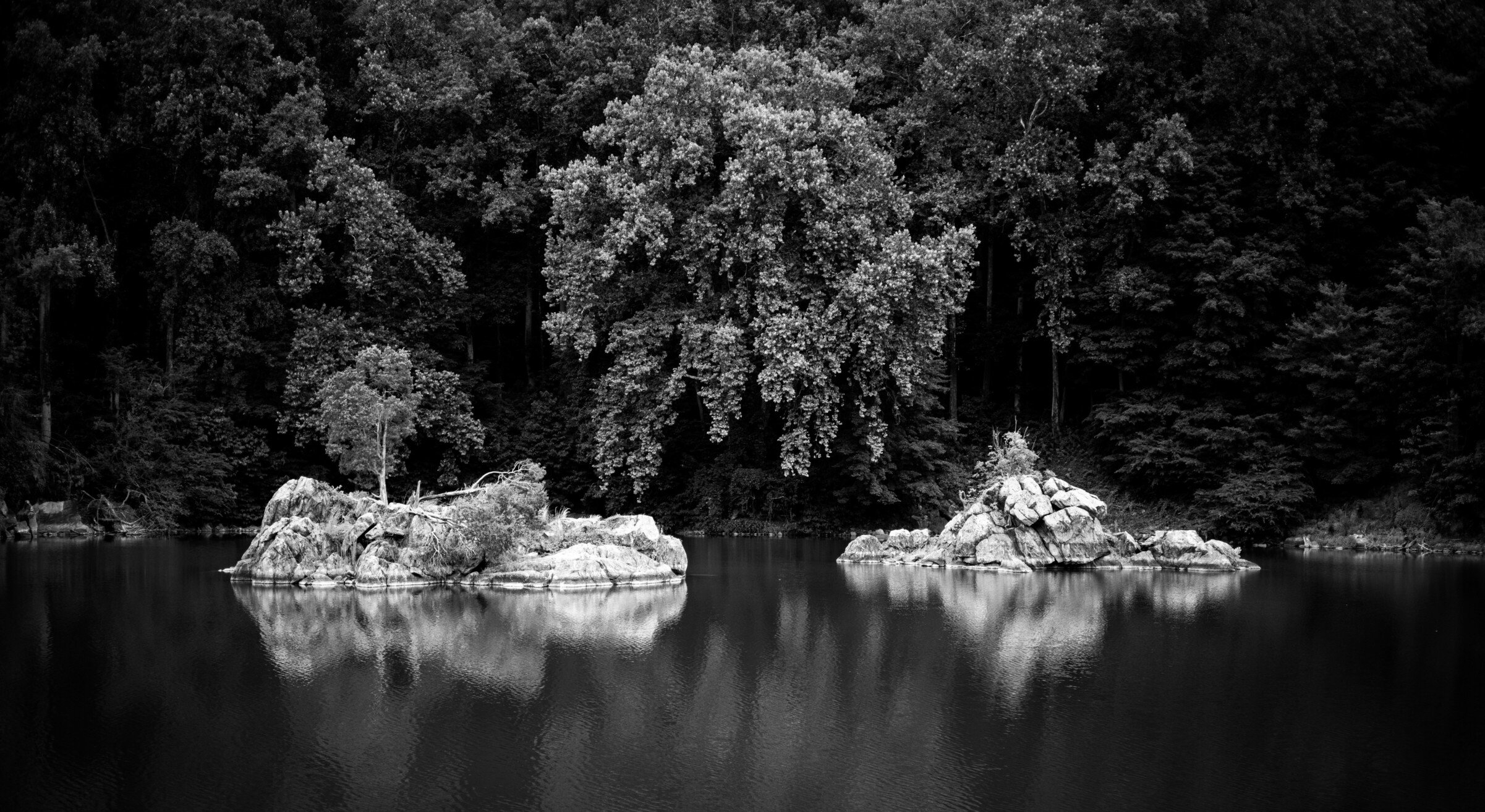
Not Twin Peaks. I like this image because of the symmetry of the two islands and the tree centered between them
Specific Feedback Requested:
Pertinent technical details or techniques:
Is this a composite? (focus stacks or exposure blends are not considered composites)
No
If you would like your image to be eligible for a feature on the NPN Instagram (@NaturePhotoNet), add the tag ‘ig’ and leave your Instagram username below.
Great shot Eduard. I am a big fan of symmetry, and I really love what you have done with it here. That center tree has a wonderful shape (and a great reflection too). I like that you did not go full mirror image to show the entire reflection of the tree. By composing this the way you have it creates a very powerful implied triangle shape.
My only suggestion is a minor nitpick. I would consider cloning away the small patches of sky in the upper left corner (ULC). They are bright enough to be a minor distraction.
What a nice, lush forest scene. I think the symmetry works quite nicely here. And the starkness of the rocks is nicely set off by the lush greens. The tree centered between the two rocks really helps make the scene. Very cool.
The contrast of the stark white rocks against the dark background is a powerful statement. This could probably make a very good b&w image. In fact, that’s the direction I would experiment with. If you study the images of good b&w photographers this type of contrast is often used to make statements and with the middle tree peering out of the darkness you could make something interesting.
I am new to the network so very much in the learning process of these critiques. The texture of the water is fantastic and I agree with the symmetry comments. I also agree with the small patches of sky as a potential distraction. As an alternative to cloning perhaps a slight crop?
I can see why you were attracted to this scene as the lush greens are quite beautiful, Eduard. The symmetry with the tree in the center flanked by the two little islands of rock works very well. My only suggestion is the already mentioned cloning of the two small areas of sky along the top edge.
Beautiful capture, Eduard! Wonderfully rich colors and very nicely balanced. I didn’t notice the sky peeking through, but Ed’s suggestion is a good one. Well done!
This is quite lovely. The lighting on the main tree and the islands is perfect. The lighter rocks and grass at the water line, at the left and right frame edges really grab my eye, though. I could see cropping to 4:5 or so, eliminating those two rocky patches, since your main idea is the relationship of the main rocks and tree. Alternatively, perhaps just darkening them would make them less distracting.
This is what I was alluding to Eduard. The b&w pros seem to be doing a lot of this sort of thing these days and this seemed like the a good candidate for this sort of exaggeration. Just my 2 cents. If you don’t like it that’s ok. It’s a sloppy jog but the idea is there.