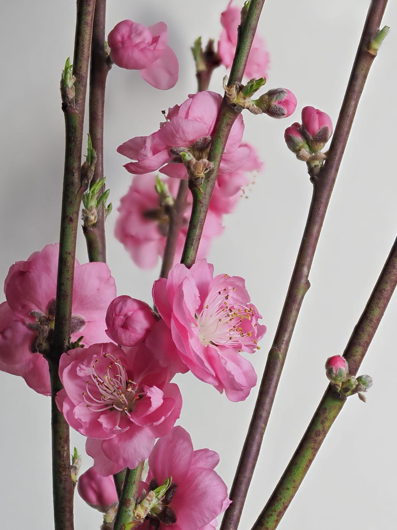
These branches were sold in a grocery store. I wasn’t sure what to do with them, but I liked the vertical lines along with the curvy pink blossoms.
Specific Feedback Requested
Any comments on composition & crop as well as any other thoughts!
Technical Details
Is this a composite: No
Olympus OMD Mark II, Olympus lens 12-100 at 75mm. 1/4 sec, f/9.0. Cut stems photographed inside with light grey background; in-camera focus stacking. Tripod
Another nice in-camera stack! I’ve been playing with that on my G9 and it’s been hit and miss. I think I’d like to see a concentration on the blossoms on the left. One is cut off and I want to see it all. Less of the stems on the right. I think you were trying to incorporate the buds as well as the blooms, right? Maybe you can arrange them differently for a tighter grouping. Color, light & processing all look good though. These are so pretty and must make a welcome sight in your house as you wait for spring to flower as fully as these.
Ann, this looks very good as it speaks well of springtime. I like the angled verticals, especially the one that starts with the blooms at the bottom and ends with a bud near the top. You have a nice mix of blooms, branches and buds. Your in-camera stack looks quite good, although I can see a few minor stack artifacts like subtle shadows near petal rims and some focusing issues (in the petal edges) in that almost open bloom on the left near the top. Yeah, I know, most folks wouldn’t notice those…
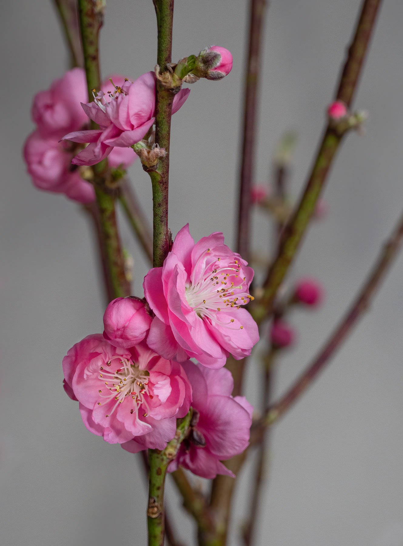
@Kris_Smith , @Kathy_Snead , @Mark_Seaver , @Tony_Siciliano : Thank you all for posting your comments! I looked through my other shots and found one with a different composition where no blossoms are cut off. This one was not stacked in camera. I used Topaz Sharpen AI on it. Same lens at 92mm, f/7.1, 1/25 sec, ISO 250.
I am interested in any thoughts about darker background and composition.
Mark, thanks for taking the close look at the stacking. I did not look carefully enough. I find stacking a hit or miss technique, whether in camera, in PS or other software I have tried. I am printing more of my work lately, so these detail are really important on enlargements.
The background, to my eye, is grayish with a very slight magenta tint. That works. Just for fun I thought I would try using a complementary color, so I added some cyan using the Selective Color layer in Photoshop. I think that works too. Both are nice.
@Tony_Siciliano : Wow! that is fantastic. I like this change and just found a youtube video that shows how to do it. Since I am doing more studio work, it is great to know of another tool to adjust the background. This tool does amazing things. Thanks so much for using it on my photo so I could check it out.