Still sitting at home when I would be at this place in May. This image benefits from a helpful critiques of other submissions.
What technical feedback would you like if any?
What artistic feedback would you like if any?
Does the brightness of the sunrise work OK in this for you?
Pertinent technical details or techniques:
(If this is a composite, etc. please be honest with your techniques to help others learn)
If you would like your image to be eligible for a feature on the NPN Instagram (@NaturePhotoNet), add the tag ‘ig’ and leave your Instagram username below.
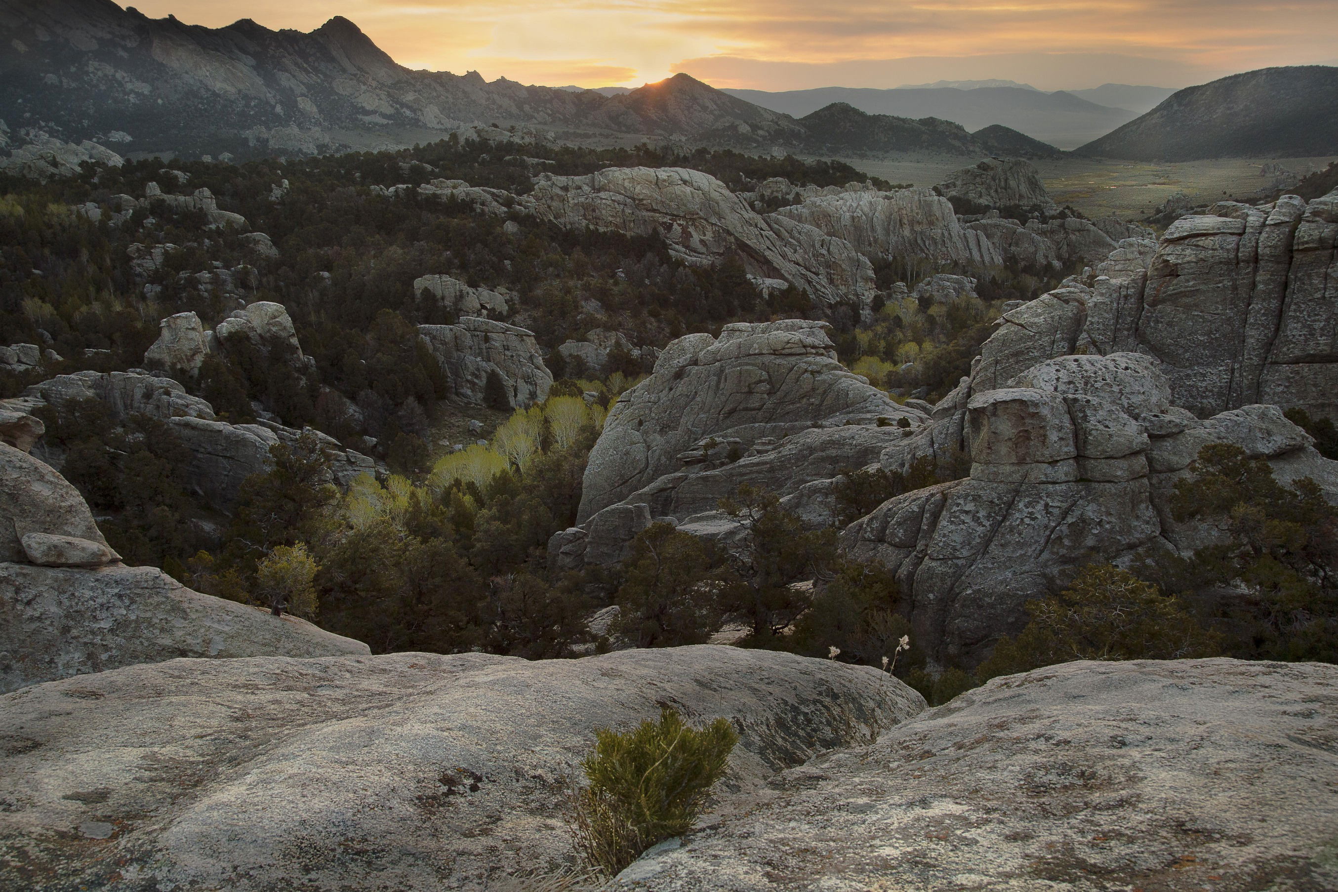
The sky looks really good to me. I am feeling like the brighter foreground is too dominant to my eye. I kind of stop there as I try to move through the image. I scroll cropped around 60-70% of it and like the results.
Hi Dick, I think the majority of the sky is fine. The transition between the highlighted area is quite harsh though. I would look at trying to give it a more even grade. I also may not try to recover the highlights so much. This will help with the transition.
I think I agree with Harley that the foreground is dominant but I don’t think that bothers me too much. I do feel that the foreground colours and brightnessare out of kilter with the red pallette generated by the sun. They should be more similar.
As an aside, there is a very clear dark section on the top of the mountains on the left. May be from using a grad in the field or applying one to the sky in post.
I don’t think the large rocks at the bottom add to the photo at all. I cropped them all out and also cropped some from both sides and think that improves the photo. I also slightly lightened the tips of the mountains on the far left. I think this emphacizes the beautiful diagonal line running from bottom left, up towards the right, and creates a more unified photo:
You are welcome. It’s very interesting to me that so many photographers feel compelled to add a foreground. Granted, it sometimes helps to create a complex, interesting composition. But too often it breaks apart the unity of the photo, creating two separate photos stacked on top of each other, or the bottom foreground creates “a wall” that impedes the vision from effortlessly flowing from bottom to top, or it’s just a random object that has nothing to do with the rest of the photo.
Brilliant rework @Tony_Siciliano, the crop elevates this image to a dramatically higher level. I actually think there is more of a sense of depth in the rework without the foreground. I also like how the rework makes the diagonal line of yellow trees more prominent in the image.
I like the sky and the midground. I feel like there is too much foreground though and wish there was more room up at top. Looks like a fascinating location to explore.
Dick, I like the rework of the expsoure here. It’s a lot more balanced.
I’m still seeing the dark to light gradation on the peaks on the left. Because it’s so prominent, its one of the first things I notice. From my crude guesstimations, it’s about 2 stops darker than the rest of the mointains. Highlighted in red.
I have done a crop too. Similar to @Tony_Siciliano’s suggestion from the left but keeping the foreground. The choice is yours here but really feel that a crop from the left works especially as you get the mountains eminating from the corner of the shot, rather than 1/8 of the way in.