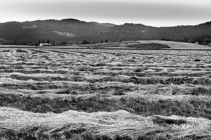
Description: I saw these newly mown farm fields on the highway and liked the way the different lines looked both in the foreground and background.
Specific Feedback Requested: Did I compose it ok? Do you like color or black and white better? Anything else…
Pertinent technical details or techniques: Nikon D3400, 55mm, 1/500, ISO 100, f/5.6, adjusted blacks, whites, shadows, contrast, on the black and white image I added a little red and green
Repost of black and white, trying to do what @Igor_Doncov suggested but probably not quite …
Is this a composite? No
If you would like your image to be eligible for a feature on the NPN Instagram (@NaturePhotoNet), add the tag ‘ig’ and leave your Instagram username below.
1 Like
Nice shot. I really like the lines of the plowed field. I think I prefer the color version.
1 Like
I think the fg looks better in b&w and the bg better in color. If you could tease out some texture out of the sky and the mountains then the b&w would be better. It looks like you did a simple conversion to b&w without any further adjustments.
1 Like
Hi @Vanessa_Hill I think that the image has a lot of potential and I’m curious as to what attracted you to the scene! I’m wondering if it’s the texture or the strong lines?
Anyways I think there are a few things you could do to make the image compelling.
One thing I try to avoid are strong lines that run parallel to the viewer. They can block the viewer’s eye from wanting to investigate deeper into the image or they can dice up the flow of the image.
Lines can be the subject so often having strong lines competes with the actual subject of the image.
I do see some nice lines further in the field. These could be leading lines that sweep up and to the small hill in the background. Getting closer to the hill would also give it more prominence to be the subject.
1 Like
Thank you @Michael_Lowe , @Igor_Doncov , @Michael_Torkildsen for looking and your thoughts! For @Igor_Doncov I’m repost it in black and white. With my limited knowledge and software I tried the best I could to bring out the BG more. The sky was just a white haze, so not much to bring out, I kind of just darkened it and tried to bring out more contrast in the distant hills. Not sure if it makes a difference…
Yes @Michael_Torkildsen as I was riding past this on the highway on my bike the lines and distant lines caught my attention. Honestly I think it better from my bike, because I was a little higher up, if it’s still like that I might try going this weekend and seeing if I can get a better angle, I see what you mean about the lines kind of going the wrong direction, but I think I could pull it off if I were next to the road, maybe early enough before traffic!  it’s definitely not worth dying for!
With these textures and patterns, go B&W all the way. The color image is okay, but the B&W allows you be more expressive in your interpretation of the scene. B&W creates a much more impactful image IMO.


 it’s definitely not worth dying for!