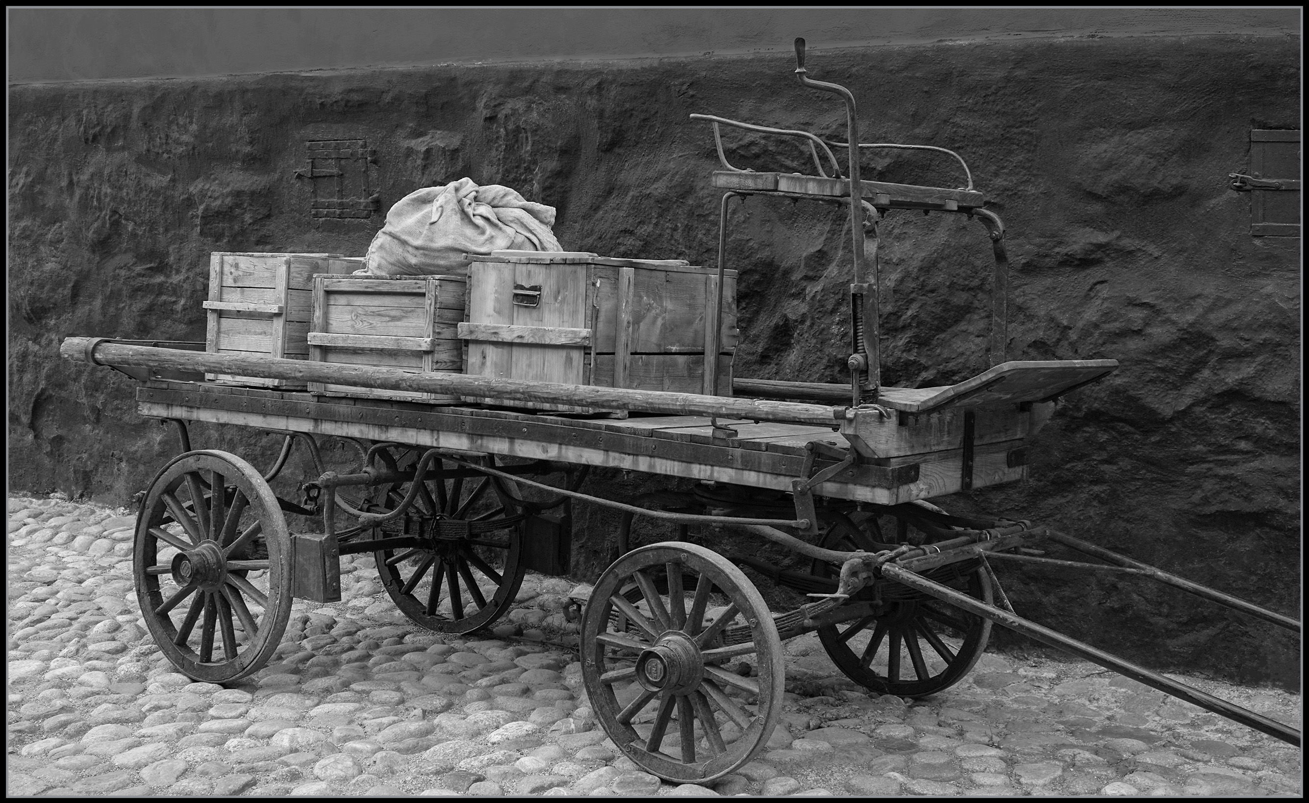
This was taken while touring a working historic community called “Skansen” in Stockholm, Sweden.
I noticed this wagon rounding a corner just ahead of us but by the time I saw it again, the wagon had been unhitched from the horse, the next time I saw it, the goods had been removed by the delivery man dressed in authentic 18th century attire.
I do have an image of the store clerk inside of the general store that operated this wagon, I’ll post that one later.
This is another one of the images in my archives that seemed to work well in B&W.
And wow, I have hundreds…and hundreds of images that have never been processed! ![]()
But rather than going back in time with my archives, I plan to get out there and shoot some fresh images with some of my new found insights learned recently here at NPN.
In the meantime, I do have a few more from the archives I’d like to share and get your feedback on.
Type of Critique Requested
- Aesthetic: Feedback on the overall visual appeal of the image, including its color, lighting, cropping, and composition.
- Conceptual: Feedback on the message and story conveyed by the image.
- Emotional: Feedback on the emotional impact and artistic value of the image.
- Technical: Feedback on the technical aspects of the image, such as exposure, color, focus and reproduction of colors and details, post-processing, and print quality.
Specific Feedback and Self-Critique
I like the look so far, I feel that the tones, shadows and highlights are fairly good but I’d like to know what your thoughts are in that regard.
Do I need to adjust anything concerning tones, shadows or highlights?
Does it need to be rotated CCW any? The camera was level but the cobblestone alley is sloping upward to the left, but does it feel like it’s good the way it is? or not?
Any constructive feedback to the items selected and mentioned would be greatly appreciated!
Thanks for looking! ![]()
Technical Details
Sony a6000, 18-105 lens at 25mm (37mm in 35mm equivalent), 1/125s, f4, ISO 125, Ps & ACR for processing (B&W conversion in ACR).