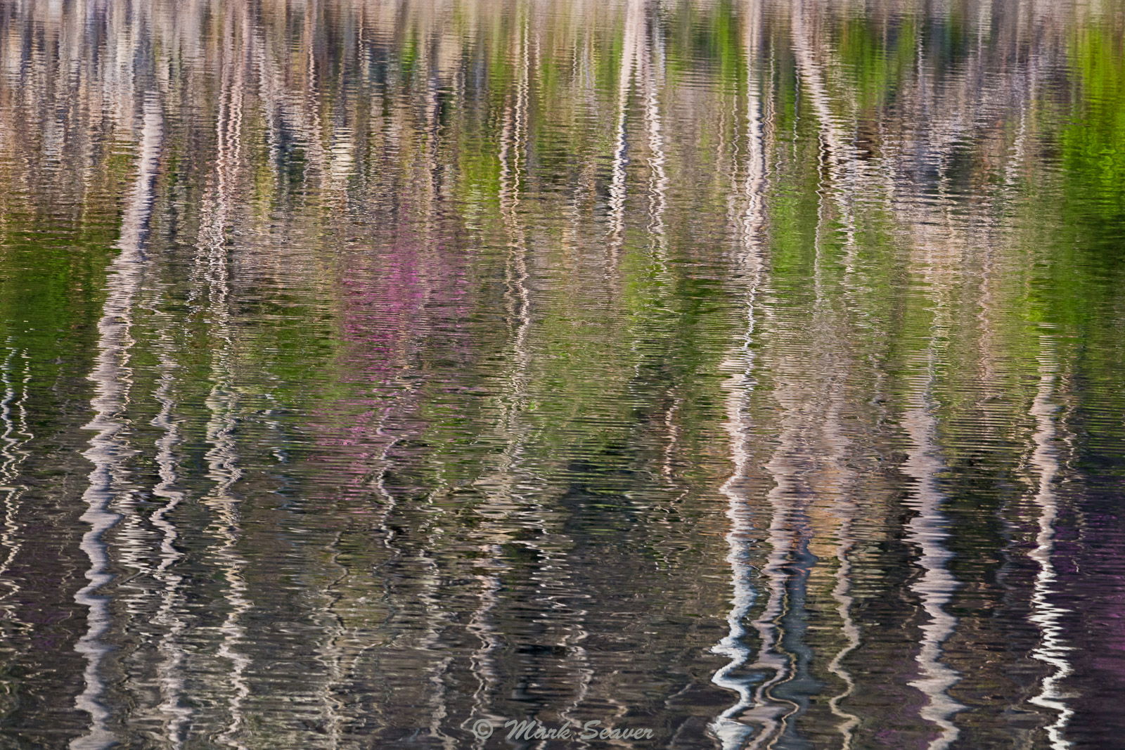
While I have a few views of trees and shrubs distorted by the prevailing winds, I thought I’d share these two views of Spring colors reflecting and the subtle changes that the strength of the breeze has on the reflections. (5D3, 70-200 @ 185, 1/10 s, f/10, iso 200, tripod)
Wonderful, Mark. The soft green/purple colors, for me, help to emphasize the vertical lines in the trees. Both images have great movement and a nice abstract feel to them. I prefer the “more breeze” simply because it emphasizes the abstractness. Great idea and nicely done.
Mark, I prefer the Less Breeze version, but if I had not seen that, I still like the More Breeze. I like how the zig-zags of the tree reflections become more pronounced as you go down through the images. Very nice abstracts!
So fun to play with reflections. The interaction of water and air produces some interesting results as you’ve shown here. You could have a go at cropping further to isolate the trunks and those crazy wavy lines. Really challenging to just pick a section!
“Remember: one man’s ceiling
Is another man’s floor” Paul Simon, There Goes Rhymin’ Simon, 1973
Wind is a friend on fields of waving grass when fall leaves rustle while clinging to branches when reflections ripple the water. It’s our adversary when delicate spring wildflowers dislocate from a perfect frame when branches intrude into our sylvan scene when perfect reflections shatter on a still mountain lake.
It’s fascinating that as photographers we can control our camera adjustments for the perfect exposure, then we are at the mercy of an episodic natural element.
I can’t make a choice, both are well done. I especially like the lower 1/3 of both, cropped to a panoramic frame. But of course, it’s one opinion.
Great look at these reflections, with a wonderful impressionist painterly look. While I quite like both, I prefer the less breeze version. A very excellent entry for the challenge.