(If this is a composite, etc. please be honest with your techniques to help others learn)
If you would like your image to be eligible for a feature on the NPN Instagram (@NaturePhotoNet), add the tag ‘ig’ and leave your Instagram username below.
You may only download this image to demonstrate post-processing techniques.
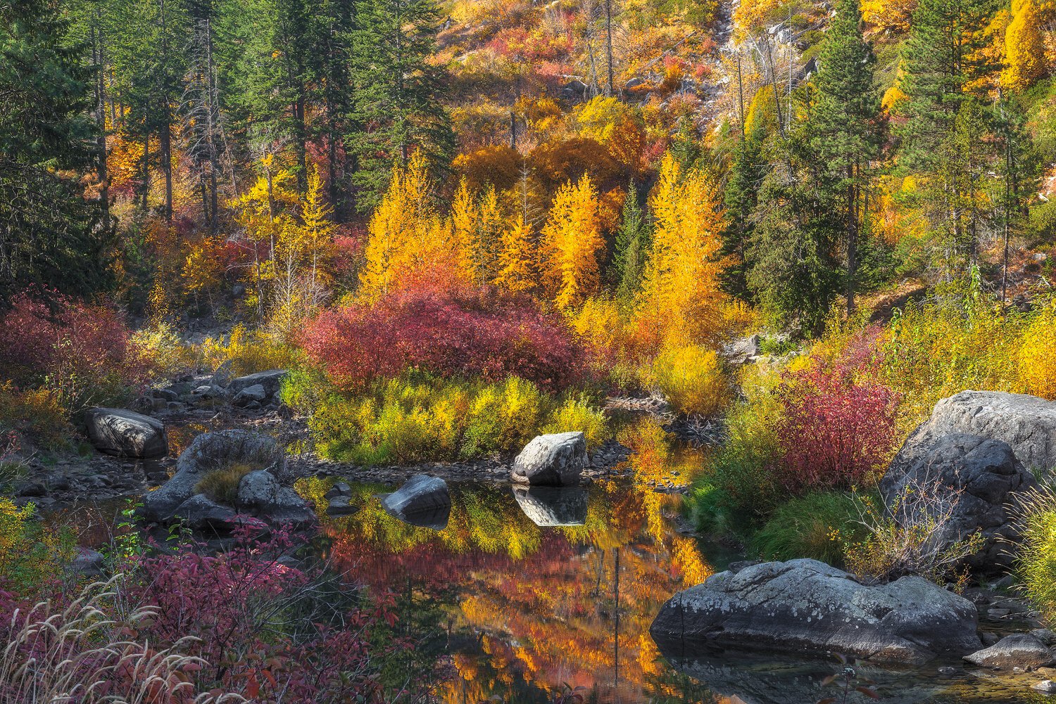
Well, this is certainly an aptly named image, Chris. Obviously, every photographer processes an image to their objectives. So, the following comments just reflect how I would have approached this image. I like the warmth in the highlights, but not in the shadows. For a bit more realistic shadows, they should be neutral to cooler blue. I also would have preferred the shadows to be darker as well. This would separate out the lower shadow areas vs the light in the upper portion of the scene. It really comes down to separating out the colors and tones more. Even in some of the low to mid-highlights I would have preferred a cooler hue. This is particularly the case on the light striking the evergreens. Just a bit too yellow for my tastes. I would like to see much more color separation between the evergreen and the deciduous trees.
Again, these are just my preferences. You have a sweet color palette to work with here!
Cheers
No critiques from me. I love the image as presented. The contrast of the warm foliage against the cool rocks works well IMHO. The reflection is a nice touch. I see an image within an image. The center portion of the photo is the strongest part to my eye .
Lots to look at, really holds the attention. It needs a big screen to do it justice. A few places on the border could be made quiet so to not draw attention.
I’m thinking that commenting on technical qualities such as contrast, density, color tint and more is pointless because people have their monitors set differently. Correct?
Hey thanks! Go ahead and show me how you see it if you would like to.
I used to get critiqued that my shadows were too cool a lot !
Here is a phone shot from that day. You can see the evergreens are a bit limey green. Not the deep dark green we are used to seeing.
Here ya go, Chris. Something along these lines. As you will note I tried to separate out those tones and hues a bit. About the best I could do with a jpg file. Mainly used tools in Photoshop such as Color Balance, Selective Color, Curves, and Vibrance. And most of those adjustment layers with targeted luminosity masks. Again, each image is a creation of the artist’s “minds eye.” My version could very well not be anything close to what you wanted.
Thanks for taking the time! If someone posted this version I would think it looked great. I see what you mean about separating the colors.
Honestly, I’m sure I did some selective color adjustments to the yellows. But masked it out of the evergreens. Probably never thought of trying to do much the evergreens. My workflow is pretty basic. I try to get to look good to me. Once it’s there, I’m usually done. Sometimes overlooking the fact that just because it looks good, doesn’t necessarily mean it couldn’t look even better! I like your rendition.
Lovely fall scene. I really like the composition you came up with here. The yellows seem pretty strong here but when I tried to play with the colors some of the punch was gone. Color is really a subjective factor. I prefer the original to the rework although Ken was greatly handicapped due to the file he had to work with. You had some pretty harsh light to work with.
Yeah, typically light I would avoid. But the backlight effect on the yellows really made the scene pop. You can see the intensity of the color in the phone shot I attached as well. I can say that this little Canyon about 11 miles long has some of the highest concentration of truly amazing colors I have ever seen!
Great to see a post from you. This is quite a fantastic autumn scene - so much great stuff packed in to a single frame!
I would agree with others around the color and overall dramatic punch this has. It’s weird though, it’s hard to point to any one color, saturation or element that tells me, yeah, too much! I think it’s just as much to say there is so much of it, it’s like adding up; in other words, small elements on their own would stand up fine without commenting - but put all of them together in one frame and it’s a bit overwhelming.
For me at least, the cell phone image looks closer to what I would think if I were standing there. In fact the pines look natural to me.
No doubt though, this would make a fantastic print (and no doubt you either already have or will be…)
So yeah, there is some embellishment here. Could probably be described in a few different ways. Artistic interpretation to potentially over processed. And where ever in between. It was an overwhelming eye popping explosion of color. Had me running back to the car for my D800! So that was my intent. I almost never am trying to render a scene as perfectly accurate to reality. I like romance and whimsical feelings in an image over absolute accuracy. And with that comes personal preference and subjectivity. So I’m not all that surprised by the comments regarding color. I think I have a bit higher tolerance for saturation. I can say that the phone shot falls a little short of the drama that the scene displayed. For me at least. When I open this 30x45 inch prepared file on my 30 inch monitor, it just makes me smile! But I will go try and take another hard look at it, keeping these suggestions in mind.
Thanks for the response Chris. And PLEASE, don’t let mine or other comments on color or critiques on the web presentation effect what you do with a very large 30x45" print. Your prints are stellar and we can’t really judge that from this web stuff. Take the critique for the web presentation and we understand we can’t always equate that with what a final print may look like.
Chris - Hey ! great to see you posting again!
This is a wonderful image - I don’t know your processing method - but this strikes me as an excellent artistic rendition - aka " Photo Art. " Beautiful as is and wonderful depth.
I do like @ken_henke 's work on the shadows , and I might suggest removing that yellow glob of a tree in the upper right - that draws my eye.
Sweet image!
Sandy
@Chris_Chamberlain, I think your original has that sense of enveloping light that is so common in the Autumn in the Sierra.
I think your original image would make a wonderful print. However, I can see where Ken is coming from as far as separating colors and tonality. His take on this as a Web image presentation works nicely.
Either way, I love the composition, and you did a great job extracting order from the somewhat chaotic scene.


 I can say that the phone shot falls a little short of the drama that the scene displayed. For me at least. When I open this 30x45 inch prepared file on my 30 inch monitor, it just makes me smile! But I will go try and take another hard look at it, keeping these suggestions in mind.