Swollen +2 Reworks

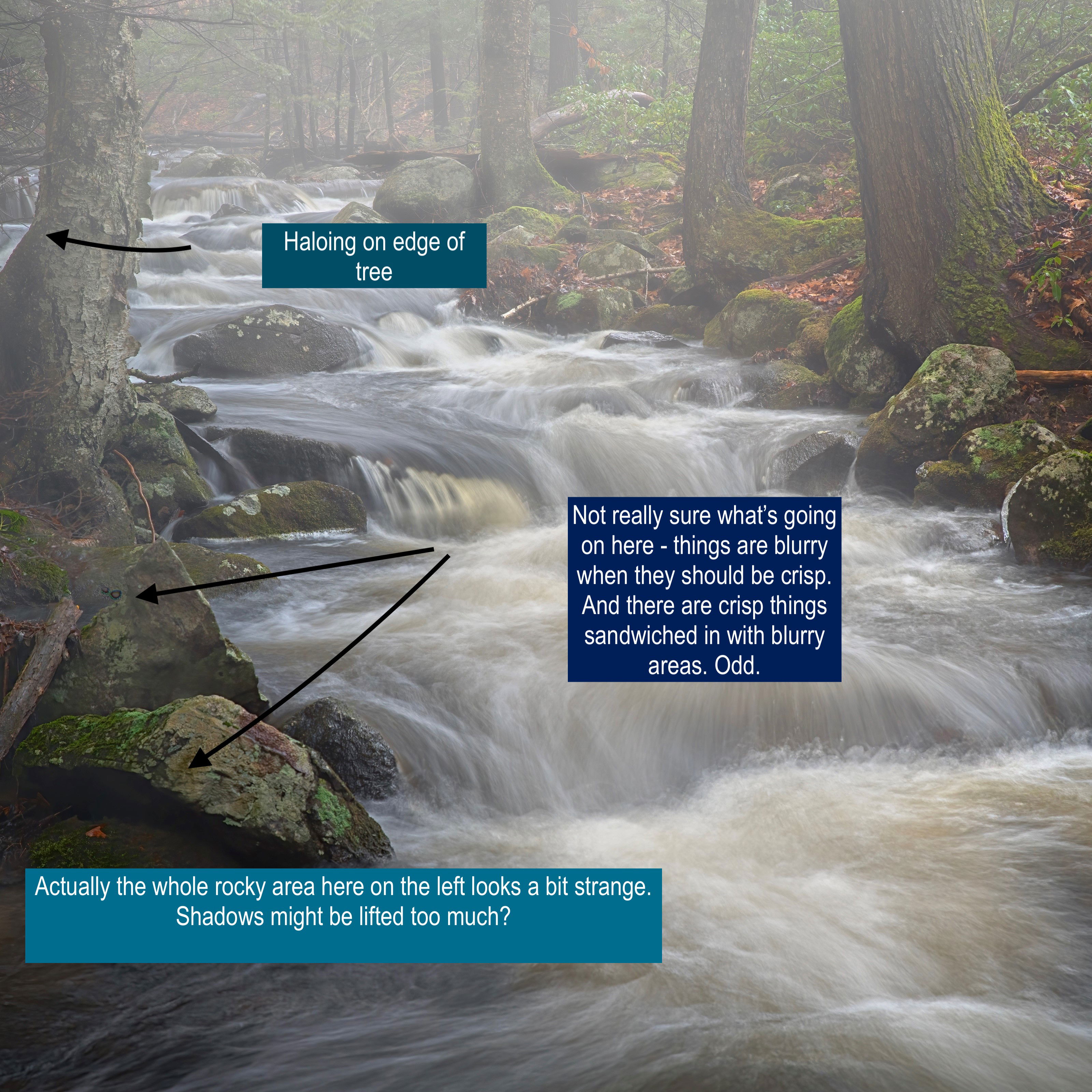
Here’s the first rework I did using suggestions from @David_Johnston @Eric_Bennett @Diane_Miller @Kris_Smith @Merv Thanks to you all for the suggestions, I think I’ve got a stronger image than I did. Most everything I did was in LR except for a quick layer adjustment in PS I couldn’t get right in LR. I edited the code of the new pic to match the size of the original, I hope I didn’t mess something up -I’m a mechanic & am much better with a wrench & hammer than I am with a mouse & keyboard…

…and I’ve finished this one. I missed a few things & wanted to draw a bit more attention to the stream. I removed a bit of haze from the prominent tree on the left & also did some work on the rocks in front of it by reducing contrast. So, as it sits now, it’s as good as it’s going to get. Thanks again to all who gave me suggestions on the first critique request for me.

Image Description

Hi there! I’m Kris Wyman & am a photographer living in western Massachusetts. I’ve been lurking here on & off for quite some time but have been photographing more regularly lately & really feel the need to get involved with a community of like minded people. I guess I’m trying to take photography more seriously & have heard nothing but good things about NPN so here I go!

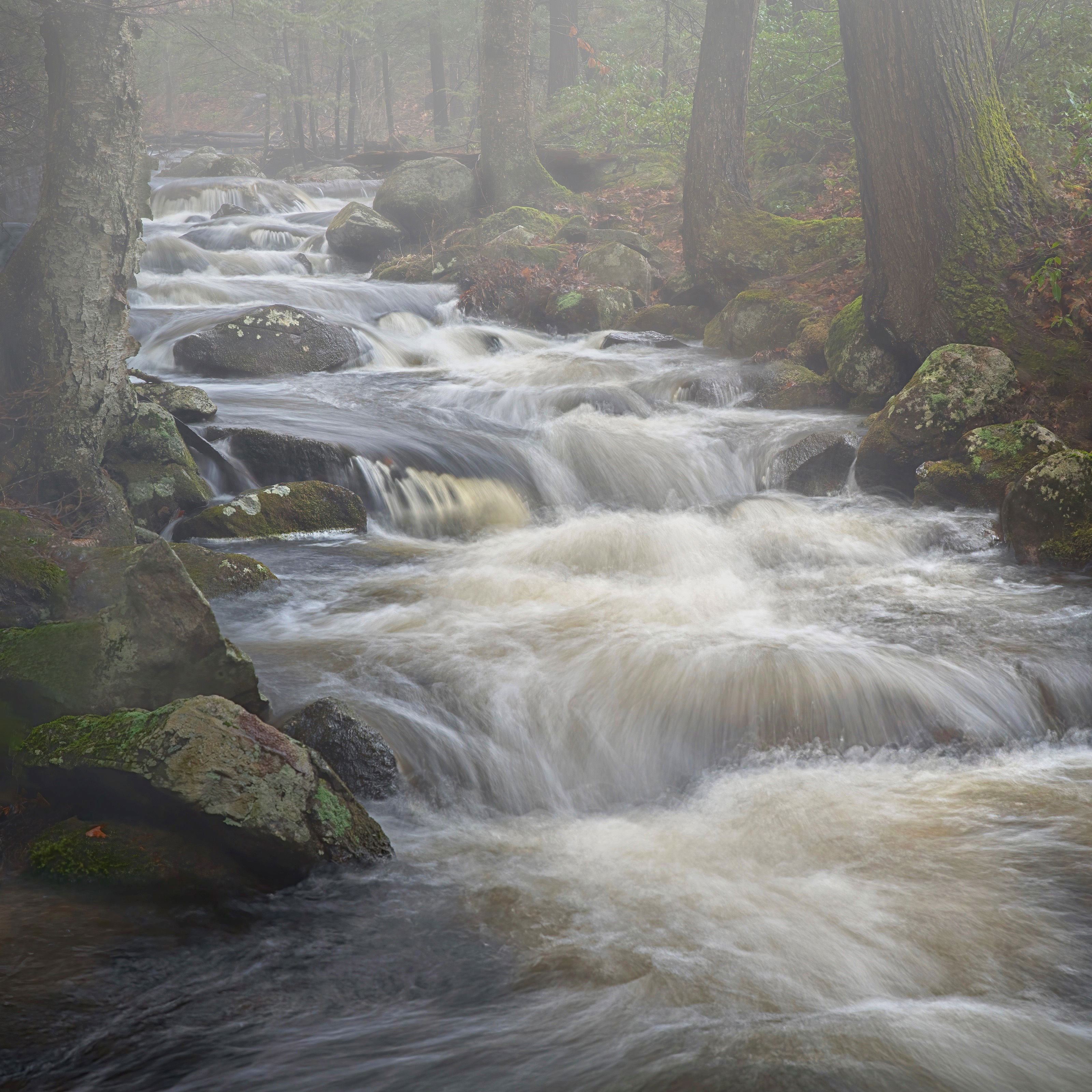
This image was shot in a local forest back in January. It’s a single frame with no focus stacking, etc. It was a very foggy day following a heavy rain the prior night. The forest was quite dark & dreary that day but the water was flowing quite strong & it was very interesting to find the shutter speed I thought worked best. Often, I wear chest waders & set uo in the middle of a stream or brook but this was shot from land.

Type of Critique Requested

  • Aesthetic: Feedback on the overall visual appeal of the image, including its color, lighting, cropping, and composition.

  • Technical: Feedback on the technical aspects of the image, such as exposure, color, focus and reproduction of colors and details, post-processing, and print quality.

Specific Feedback and Self-Critique

I shot a number of aspect ratios from this location including 1x1, 3x2 & 4x5. I concentrated on the square image first. Although it was quite foggy, I added a bit of negative dehaze in spots to this image. I may well have gone overboard, especially in the lower left hand corner. That area was really clean & contrasty compared to the rest of the photo so I tried to balance it out with the rest of the frame. I also added a bit of warmth to the right hand of the frame in the forest & coolness to the left, especially into the shadows. I think I did it subtly but I’m not sure.

I’m probably going to start this one from scratch via virtual copy in LR & would love to hear what others think of the image as it’s already done. I’m hoping to work the suggestions from this critique request into the next try. I really have no other photographers to run images by & far too often end up with overly colorful images. I’d like to learn even more restraint & I’m looking forward to the feedback from NPN.

3 Likes

Hey Kris! Love this shot. Reminds me of something I’d see in my neck of the woods. I really like the overall vibe of the photo and the mist lingering above the water. It’s very nice. One of the things I notice composition-wise is feeling a bit stuck on the left side where there’s another glimpse of the water. Opening that side up, or removing that tree would make it less cluttered and more easily explored in the frame. Other than that, stellar shot!

1 Like

Hi David, thank you for the feedback! It’s funny you mention that tree, I wrestled with that part of the photo quite a bit. I meant to tone down that little slice of water but never got back to it. I’ll revisit that particular part of the shot for sure, I have a good chunk of the forest in the original file.

Yeah that’s one of the hardest things about photos like that haha

1 Like

I think this is a very nice scene, the only thing I would recommend is to play with the luminosity a little bit. The entire scene is the same value, I would slightly brighten the center more and darken the edges and especially the bottom to direct the eye in the direction of the stream more.

1 Like

Thank you, Eric, I really appreciate the feedback! I will incorporate your suggestions when I re edit this one & try to keep an eye out for this in the future.

Welcome, Kris! I love the shapes the water makes as it dances down over the rocks, and the subtle gold tones. The fog gave you a wonderful softening of the BG. I think a bit of edge cleanup could work well here – the triangle and fallen limb that @David_Johnston mentioned, and the stick coming in from the right side – if you’re into removing things. I’m always amazed when I do a bit of cloning on a top layer then click its visibility in and off, how much difference it makes in keeping my eye on the area of interest.

I think you’ll find this a great place to hang out and I look forward to seeing more of your work.

1 Like

Thanks for the feedback on this one, as well, Diane! I didn’t do any clean up work on this one but the when I do this one again, I may remove those distractions. This was shot back in early January & since then we’ve had a couple of heavy, wet snowfalls & an ice storm. The area currently has more trees, limbs & sticks down than I’ve seen out there. I’ll have to be physically removing them in certain areas as spring progresses. I think there will be some really nice photos to make out there, especially when the laurels bloom in late spring & also when the foliage turns in the fall.

Can’t wait to see them!! I’ve often thought about adding a small chainsaw to my photography kit.

Hi Kris from Kris - Glad you de-cloaked and joined us with this terrific scene. I used to live in Southern NH and so loved our rivers and streams. Not that I don’t have those where I am now, but I’m looking forward to some more New England images.

You have some good comments and advice already so I’ll just pick on a couple technicals -

It’s the strange in and out of focus bits that are the most perplexing to me.

But other than that, I think you’re on your way to a fantastic photo. The mist especially makes this distinctive.

If you do make changes and have a second edit, you can add that to your original post by clicking the pencil (edit) icon. This allows us to compare both photos in the viewer one after the other. You can also edit the title with something like + 1 Rework or similar to alert the group that you have done it.

Cheers!

1 Like

Hi Kristin, thank you for all the advice! I’m totally responsible for the wonkiness in lower left hand corner. In the file, that area was a lot more contrasty than the rest of the photo & really pulled my eye. I lifted the shadows & went a little overboard with the negative dehaze! The two parts you’ve pointed to are very strange. The two spots on the upper rock are most likely Topaz Denoize artifacts -I shot this at ISO250 IIRC & it was underexposed so I ended up with a lot of noise. I’m not sure what’s going on with the lower rock, though. I think one of my issues with developing images in general is that I don’t inspect them close enough & I really need to let them sit awhile before I call them done. I no longer have a website but at some point this year, I plan to build put something together as a portfolio site. I also do a lot of printing at home. I love being able to hold a finished print in my hands, it really brings the process to a close when I’ve run through the all of the steps from the shooting through to print -just makes it a bit more “real” than looking at it solely on a screen.

Great river image Kristopher. The fog and motion of the water pulled me to the scene as soon as I saw it. Water is one of my favorite items for landscapes. However, when the water is running like this it is hard to find the perfect spot.

1 Like

Hi Bradley & thank you! I’ve begun to notice that water is my favorite subject to shoot. I often to get into the water & find a pattern in the whitewater to use as a foreground but not this time as the current was a bit strong. I’be just begun working on an abstract series I call “Riffles” shot at a spot on this brook that has really caught my attention. I see faces in the water & so far have found a dragon & fave recoiling in horror. I have quite a few more frames to work with before I’m ready to share them but I’ll definitely be posting them here for processing advice.

Edit to add: I think the halo on that tree you’ve pointed out is chromatic aberration from the lens. I shot this on a Tamron 24-70 f2.8 G2 which is supposed to be a great lens. I’ve found it to be a dud. There is a winter scene I shot in some snow & I’ve never seen the level of CA in from any other lens. I think I may trade it in for a relatively wide tilt shift lens. I’ve been using my Nikon 24-120 f4 & to my eye, it produces much better images than the Tamron.

Kristopher,

Welcome to NPN! Great to have you hear and congrats on posting such a beautiful first image!

I love the mood and atmosphere and really think the square framing works perfectly for this scene. I also just love the shutter speed where the texture and flow are showcased wonderfully. I think you tamed thw water in the LL very nicely with the dehaze. If anything, the only thing distracting to me in that lower area is the fallen log/branch resting on those rocks. Not a huge deal or image killer by any means, but does grab the eye. Otherwise, the foggy/misty atmosphere again is wonderful here.

Welcome aboard! We look forward to your images and your participation and critiques!

Lon

1 Like

Haloing, especially at the edge like that, could be the lens. I assume you’ve tried the lens correction in PS or raw conversion? They can be inadequate, though.

I made a surprising discovery the other day. I re-processed some VERY old images (2006) from the Canon 20D and the original Canon 24-70 f/2.8, which was not up to snuff, to put it mildly. I opened them in Lr and went to the latest Calibration Process. The images were not as noisy as I expected, but I found that a run of Topaz Denoise in Low Light mode (at defaults) gave me a nice bit of sharpening. Then I noticed that it removed a fringe of CA along some edges!

Haven’t had time to explore it further, and it may only be noticeable on these old 20MP files. But I thought it was interesting.

Hi Kris and Welcome to NPN :slight_smile:

I hope you enjoy this community of very skilled photographers and masters of post processing as much as I do.
We’re all eager to help each other achieve our goals in whatever way we can.

I really like this image quite a lot!
There are two main elements that make this a dramatic image in my view, one is the fog and the other is the water (more specifically, the power of the water).

I think Eric said it very well in terms of what could be done to improve the visual effectiveness and to bring more emphasis to the fog and the power of the water.
I suggest going further than making adjustments to the luminosity, but, going further really requires doing an example edit to demonstrate what is being proposed (it would be too difficult to convey with text alone IMO).

I tried a few different treatments before I was able to get the desired effect shown in the example edit below, it often requires experimentation with various tools and blends because each image is unique.

Note: All edits were done in Ps.
The first thing I felt it needed was more texture and brighter luminosity in the water, I finally landed on using the High Pass Filter to bring out the deep texture, then used an Exposure mask where I increased the Gamma slider a little (there are many ways to achieve the same or very similar results so pick whatever method works best for you).

The next thing was a fair amount of cloning, most of the cloning was done with a clone brush in the Normal Mode set at roughly 40% opacity in various sizes. The idea was to clone out horizontal limbs and bright spots that aren’t helping the scene, the next part was to clone over some of the brighter orange leaves so they aren’t drawing attention.

Then increase the fog appearance over the left side as well as the right side so the trees and foliage are somewhat muted, the idea is to retain detail but mute it so the viewer’s attention is sort of “Pushed” towards the water. This task was achieved by using another Exposure mask but this time, I pushed the Offset slider to the right while leaving the Exposure and Gamma sliders at default.

Something worth pointing out is that the added texture and luminosity in the water extends into the foggy area in the BG but in a semi gradient way, and even though the water is more clear up into the fog, it doesn’t feel like it subtracts from the sense of fog in the BG area (at least not to me).

Also worth noting is that I felt that the clarity, contrast and focus of the big rock in the LLC was drawing too much attention from the water so I blurred it slightly, covered it with some fog effect and blended it in a little more.

The area to the left of the big tree where you can see part of the waterfall was a real attention getter so I done some cloning there as well just to remove the desire to want more of it. I completely agree that stepping farther to the right for more of that part of the waterfall might have proven to be too risky! :slight_smile: Never take unnecessary risks just for a different composition.

Now when I look at this image, my attention lands first on the FG water texture and luminosity, then my attention keeps flowing into the image via the water and without any elements on either side that suddenly draw my attention away from the water, the side elements are there to enjoy but they no longer dominate the scene. I hope that makes sense.

Please realize that the edits were just to demonstrate that often times there are practical and/or creative ways to achieve your goal in post processing.
The edits may not be appealing to you, or maybe only parts of it are appealing to you.
Bottom line is it’s your image so take what works and disregard the rest (or disregard all of it, that’s up to you).

Anyway, I hope this helps :slight_smile:

Thank you for the compliments & suggestions, Lon. I’ve gotten so many great ideas for just this shot over the last day, it’s great! I think I’m really going to enjoy this site!

1 Like

Hi Diane, yes, I ticked remove CA in LR -I have it set to do it on import. I’m going to take a look at the raw file to see what it looks in that file & go from there.

Hi Merv, wow! There is so much information you’ve conveyed in this post. From a bird’s eye view, your changes look fantastic!! I think you’re editing ability is far beyond what I’m capable of but I’m going to look deeper into everything you’ve written & see what I can do. I won’t have a chance to sit down & give it a thorough try til Saturday as I’m limited on time til then but I’m really looking forward to going back through your contribution & see if I can learn some new techniques! Thank you again!